
@devanshraghav

Carlton
@CarltonMpofuAll comments
- @CarltonMpofu
Hey, hey, congratulations on completing the challenge :)
Here are some pointers to note:
- It's great that your form tells the user when they enter invalid input for the days, months, and years. However, it does not stop it from calculating the age when the user clicks the button. Ensure that it does not allow it to go on with the calculation when the user enters any invalid input for the day, month, or year.
- No hover state for the button. Change the button's color (to off-black) when the user hovers or clicks on it.
- Your form is excellent for desktops but is not responsive enough for mobile phones. For example, the entire structure is not shown for mobile phones with a width of less than 578 pixels. You can consider adding another media query for this or changing the "wrapper" to have a smaller width
Hope that helps :)
Marked as helpful - @henriquelmk@CarltonMpofu
Awesome work!
Looks good.
Congrats on completing your first challenge.
Keep going :)
- @robinjmm@CarltonMpofu
Looks great! Love your code, I learned a few things from it.
- P@bmoore15v@CarltonMpofu
Hi.
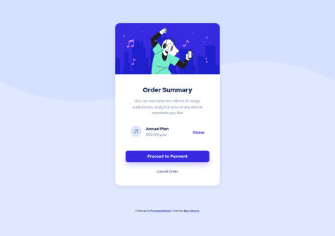
It seems like the browser does not show the whole background image. Use background-size:contain in the body to make it show the whole image. However, the browser will not show the whole image when you zoom out. Refer to https://stackoverflow.com/questions/17555682/height-100-or-min-height-100-for-html-and-body-elements on how to apply a background image that fills the entire browser.
Setting the width of the summary-container to 450px does will not make it responsive. The width will always be 450px, even on a device with a smaller size. The summary-container will be too large, especially on mobile devices. Instead use max-width:450px to make it more responsive.
Also, add the property max-width:100% to the illustration image to make it fill the container regardless of the size.
Marked as helpful