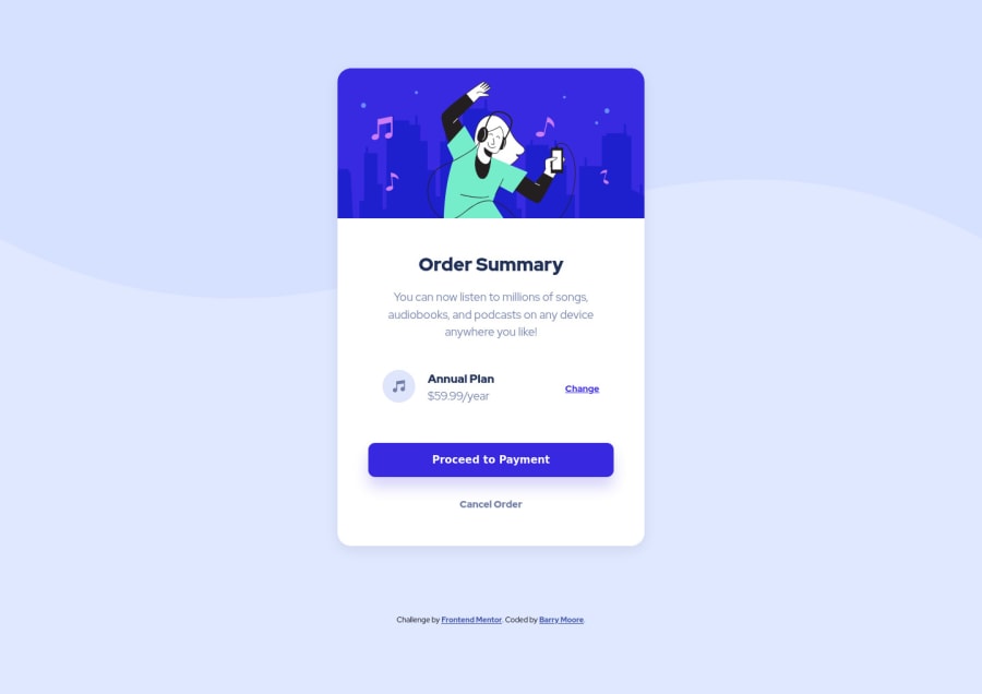
Design comparison
Solution retrospective
I don't have any formal training on what "good code" is supposed to look like, so my worry is that my code looks a 3 year old's grammar sounds. Ha.
If anyone has suggestions on "best practices" when it comes to code layout, that would be helpful. Should I group my CSS differently? Is there a better way to make my code readable? Any resources to read or watch would be welcomed as well.
Thanks!
Community feedback
- @CarltonMpofuPosted over 3 years ago
Hi.
It seems like the browser does not show the whole background image. Use background-size:contain in the body to make it show the whole image. However, the browser will not show the whole image when you zoom out. Refer to https://stackoverflow.com/questions/17555682/height-100-or-min-height-100-for-html-and-body-elements on how to apply a background image that fills the entire browser.
Setting the width of the summary-container to 450px does will not make it responsive. The width will always be 450px, even on a device with a smaller size. The summary-container will be too large, especially on mobile devices. Instead use max-width:450px to make it more responsive.
Also, add the property max-width:100% to the illustration image to make it fill the container regardless of the size.
Marked as helpful1P@bmoore15vPosted over 3 years ago@CarltonMpofu Thank you for that feedback! That was helpful. I noticed the background was not responsive on mobile and couldn't figure out how to make it fit. Your max-width suggestion worked perfectly.
0 - @Juveria-DalviPosted over 3 years ago
hey.. the accessibility issue says that you should have wrapped all divs in <main> which is the semantic tag ,except for the div with class attribution that should be wrapper in <footer> tag And you should use <h1> tag for "order summary" the heading, for more details refer w3school. Also if you're struggling with layouts watch' traverse media
<body>
<main>
All Divs here..
</main>
<footer>
Div with class attribution here..
</footer>
</body>```
Marked as helpful1P@bmoore15vPosted over 3 years ago@juuveria Oh, wow! I didn't even know there was a solution report. Thanks for the heads-up and the feedback! I don't know much about accessibility rules, so thanks for pointing that out. I will have to read up on them. I made the changes you suggested and some others from the report. Thanks, again!
1
Please log in to post a comment
Log in with GitHubJoin our Discord community
Join thousands of Frontend Mentor community members taking the challenges, sharing resources, helping each other, and chatting about all things front-end!
Join our Discord
