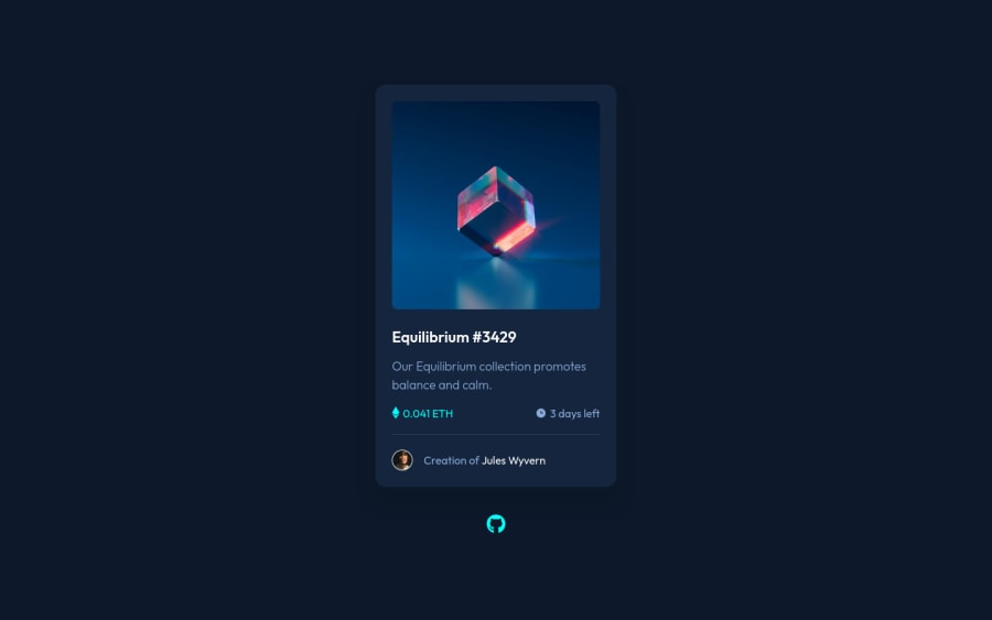
Design comparison
Solution retrospective
Any feedback on how I can improve my code?
Community feedback
- @MohamedAridahPosted almost 3 years ago
Hello @robinjmm,
I have some notes for you:
-
use
<a>element instead of span for.nft-card__creator-name. It's more Semantic and on click this name this may lead to another page. -
you can just use
<img>instead of.nft-card__eth::beforeand.nft-card__timer::before. the current way is totally right. -
instead using both
::afterand::beforepseudo elements you can use one of them as the styles below and everything will work fine:
.nft-card__bg-layer::after {
        content: url(./images/icon-view.svg);
        position: absolute;
        background-color: rgb(0 255 247 / 45%);
        width: 100%;
        height: 100%;
        opacity: 0;
        top: 0;
        left: 0;
        display: flex;
        align-items: center;
        justify-content: center;
        cursor: pointer;
       border-radius: 1rem;
        overflow: hidden;
        transition: .3s ease;
	}
.nft-card__bg-layer:hover::after { opacity: 1; }-
use
transitionproperty for smoother hover effect for both.nft-card__headingand.nft-card__creator-name -
you can see My solution for this challenge it may be helpful for you..!
I hope this wasn't too long for you, hoping also it was useful😍.
Goodbye and have a nice day.
Keep coding🚀
Marked as helpful1@robinjmmPosted almost 3 years ago@MohamedAridah Thanks for the tips. I totally missed the name of the creator being a link. You were also right about the background layer and the view icon. I could've just combined them into one. I was too focused on implementing them I didn't care for efficiency at all.
Thank you very much.
0@MohamedAridahPosted almost 3 years ago@robinjmm you are welcome👍🌹. I'm glad this was helpful for you.
0 -
- @CarltonMpofuPosted almost 3 years ago
Looks great! Love your code, I learned a few things from it.
1
Please log in to post a comment
Log in with GitHubJoin our Discord community
Join thousands of Frontend Mentor community members taking the challenges, sharing resources, helping each other, and chatting about all things front-end!
Join our Discord
