Not Found
Not Found
Not Found
Not Found
Not Found
Not Found
Not Found
Not Found
Not Found
Not Found
Not Found
Not Found
Not Found
Not Found
Not Found
Not Found
Not Found
Not Found
Not Found
Not Found

All comments

  • Daniel 🛸 44,230

    @danielmrz-dev

    Submitted

    Hello! I'm Daniel and this is my solution for this challenge! 😊

    Very interesting project. Since I decided to use input type="range" instead of an image, I struggled a little bit to get that gradient correclty. I managed to do it though. Well, I did my best with the skills I got.

    If you have any suggestions on how I can improve this project, feel free to leave me a comment!

    Feedback welcome 😊

    Chris 520

    @9CB5

    Posted

    As someone who has done a similar solution I understand the hardships!

    It looks very cool but be careful with browser support when it comes to input ranges. For example if you view your solution in Firefox the gradient doesn't exist and the slider thumb is not circular.

    Marked as helpful

    1
  • Aaryn 130

    @Aaryn-Robinson

    Submitted

    The most difficult part of the project was getting my mobile menu to work properly. Can someone look over my code and help me find out why my hamburger menu isn't working when the screen is below 768 pixels?

    Open to all forms of constructive criticism. Please let me know where i can improve. Thank you!

    Chris 520

    @9CB5

    Posted

    In your media query, you have the following class:

    .navbar{
    display: none;
    }
    

    This code above is the reason why your mobile menu isn't showing. Replacing it to display: block should fix it.

    Hope this helps.

    Marked as helpful

    1
  • @siva-krish45

    Submitted

    When I looked at this challenge, I thought the main challenges would be the message box and the storage capacity box. So I researched for a solution and came up with the following CSS properties: clip-path, -webkit-appearance, and better usage of before and after pseudo-elements.

    I solved the storage capacity box using the before and after elements. However, I also tried using the input[type="range"], progress tag, and meter tag. Unfortunately, each tag has its own disadvantages, and it seems impossible for me to solve it using the above three tags.

    Has anyone out there solved the storage capacity bar using input[type="range"], progress, or meter tags?

    If you have done it, please share your code and also provide your valuable feedback on the solution.

    Chris 520

    @9CB5

    Posted

    I have used an input range in my solution for this challenge and you can view it by looking at my profile.

    I found it surprising how difficult it is to style an input range. There's no easy way to create a gradient trail and I had to resort to writing some hacky JS code to match the design. It also renders differently on different browsers so you'll have to style for each browser individually.

    0
  • @arifaisal123

    Submitted

    Another challenge completed!

    However, I'm down with a very strange problem for this challenge, and I ask my fellow learners to help with a solution for this!

    I did not take a mobile-first approach for this design, which means I created the desktop version first, and then used media queries for mobile responsive version.

    The issue is when I check my mobile version with chrome/firefox developer tools, I did not seem to have any problem, and the mobile version perfectly resizes and creates the layout I want to. On the contrary, when I actually view the site from my mobile, I seem to find no responsiveness in it, and it is just the desktop version showing on my mobile.

    I tried removing caches on my mobile, and included the responsive meta tag in the head element of my HTML, but still there is no progress on this.

    Anyone has any solution to the problem I'm facing?

    Chris 520

    @9CB5

    Posted

    This might sound dumb but have you checked the width of your mobile? Your phone might be wide enough that it's not triggering the mobile view. I just checked your website on my phone (Pixel 6 Pro) and it is showing the mobile view.

    Marked as helpful

    1
  • Chris 520

    @9CB5

    Posted

    Great solution! The search works perfectly, but I think it would be better if you could search for an IP by pressing the "Enter" key to save some time.

    Happy coding 😊

    Marked as helpful

    0
  • Sam 910

    @JustANipple

    Submitted

    Hi everyone! i managed to complete this challenge!

    My only concern is that the dropdown menu part has a lot of code to make it fit both the mobile and the desktop views, so it looks like there is something i'm missing

    Is there any way to achieve the menu part with less code? do you recommend a framework like bootstrap to make this easier to tweak with?

    Thank you all for the support!

    Chris 520

    @9CB5

    Posted

    Great work. It almost matches the design perfectly!

    As for your question, the code in your nav isn't that bad. There's naturally going to be a lot more code than a typical nav since this one has multiple dropdowns with lots of children inside. But you can really trim down your markup if you use a front-end framework like Vue for example and using list rendering with v-for for the dropdowns. You may also use tailwind to reduce code in your stylesheet.

    Going through your solution, I have noticed a few minor issues which I will highlight below:

    • The animation takes too long on the dropdowns and the fact that it starts off fast then slows down makes it feel clunky. You should aim to minimise waiting times for better UX.
    • The layout breaks on some screen widths. For example, when viewed on the iPad mini (768px), the header has a white gap on the right hand side, and on the surface duo (540px) some images are off-centered and there are some overlapping elements.

    Marked as helpful

    1
  • Chris 520

    @9CB5

    Posted

    Hi. You can just set a fixed height on the header such that it ends in the middle of the ip information div. You can achieve this if you remove flex: 1 in your header and change height to something like 14rem.

    Hope this helps. Happy coding.

    Marked as helpful

    1
  • @SaeM843

    Submitted

    Hi there, I’m Sae and this is my solution for this challenge👋

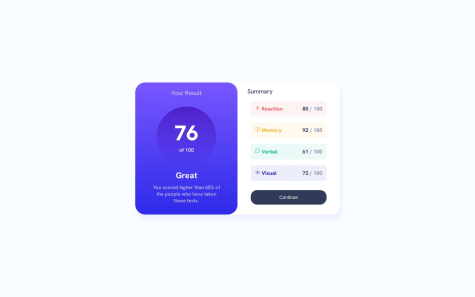
    Any feedback on how I can improve code, especially the right summary section, are more than welcome!

    Thank you.

    Chris 520

    @9CB5

    Posted

    Great solution. There's not much to improve on, but if we're going to nitpick:

    • The "summary" header is in line with the list if you look at the design. Simply adjust your margin on your li to margin: 8px 10px 18px 0px; to get them in line.
    • Avoid using percentages for your border radius, otherwise you get a weird pointy/curvy corner.
    • Increase the border-radius on the button for a more pill shape look.
    • Implement the mobile design.

    Hope this helps. Happy coding :)

    0
  • Chris 520

    @9CB5

    Posted

    The IPify API takes an IP address, and if it's a valid one, it will give you a bunch of details including the longitude and latitude. These are your coordinates.

    Once you have data above, just pass them to the map framework you're using.

    Marked as helpful

    0
  • @g-pg

    Submitted

    Hey! This is my first Vue project. And I'm curious:

    1. In this challenge, how did you ensure that the positions of the SVGs matched the design?
    2. When using a framework, what's your preferred approach for creating a burger menu? Do you create a new Nav component specifically for the burger or do you attempt to adjust everything within the same component?
    Chris 520

    @9CB5

    Posted

    Solid solution! To answer your questions:

    • Ideally you should have access to the figma file as it will reveal the exact size and positioning of the assets, but sadly you need to have a premium subscription for this. Alternatively, you can use a browser extension called "Perfect Pixel" which takes an image and overlays it on top of the page you're working on.

    • Only make a component if it's going to be reused elsewhere in the project or you want to reduce the code on a file. In this case, a burger will only be used in the nav and is not that bulky in terms of LOC, so there's no need to make a component.

    1
  • Chris 520

    @9CB5

    Posted

    Great work, but one major flaw I noticed is that the ip-info div moves up or down depending on the height because of position: absolute and bottom: 30%. This meant that in devices with a short screen height (e.g. nest hub) the ip-info div goes high enough that it ends up covering the input box and the user unable to search for IP.

    To fix this, remove the properties I mentioned, set a margin-top to the ip-info div, then set a fixed height on the header and map component.

    Marked as helpful

    1
  • @vaibhavprasad54

    Submitted

    This was a totally thrilling and challenging project, creating the UI was easy, the challenge was to integrate maps. I loved making this one and also went through a lot of errors which made me understood API request error and how to identify and solve them.

    Chris 520

    @9CB5

    Posted

    Very cool solution. The UI responds well and almost matches the design perfectly. However, I have some suggestions that could improve your solution:

    • Remove API call per keystroke. While it may feel more responsive, it is very wasteful. It's good practice to minimise the number of requests you do to reduce stress on the server. You also only have 1000 free requests on IPify API which isn't a lot.
    • Add some feedback to the user when the API call errors. When I searched for "1" it took me some time to figure out what to do next because I wasn't sure whether there was an error or the server was just being slow.
    0