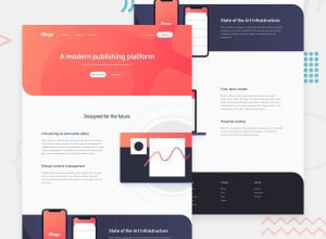
Design comparison
Solution retrospective
Hey! This is my first Vue project. And I'm curious:
- In this challenge, how did you ensure that the positions of the SVGs matched the design?
- When using a framework, what's your preferred approach for creating a burger menu? Do you create a new Nav component specifically for the burger or do you attempt to adjust everything within the same component?
Community feedback
- @9CB5Posted over 1 year ago
Solid solution! To answer your questions:
-
Ideally you should have access to the figma file as it will reveal the exact size and positioning of the assets, but sadly you need to have a premium subscription for this. Alternatively, you can use a browser extension called "Perfect Pixel" which takes an image and overlays it on top of the page you're working on.
-
Only make a component if it's going to be reused elsewhere in the project or you want to reduce the code on a file. In this case, a burger will only be used in the nav and is not that bulky in terms of LOC, so there's no need to make a component.
1@g-pgPosted over 1 year ago@9CB5 Thanks for your reply, Chris! I didn't know this extension and I loved it. But what I meant was the actual technique used to position the SVGs that stick to the sides of the page. At first I tried creating a div with
background-image
to get this effect, but couldn't make it work, so I went for the img element withposition: absolute
.Regarding components, I tend to create a lot of them to improve readability. With React this kind of works, because I can make multiple components in the same file. In Vue I would have to create a new file for every component, so maybe it wouldn't work as well. I thought separating almost everything in components was good practice, but I see very few components in other people's projects.
1@9CB5Posted over 1 year ago@g-pg Ahh, my bad. I'm not sure if you'll be able to achieve the same effect with
background-image
as background images cannot overflow outside the div they are contained in, and the SVGs come out of the div in the design (e.g. mobile phones in the infrastructure section).It's definitely good practice to split up your project into components, but if overdone, your project can become too fragmented. The program flow will be harder to follow as you'd have to jump from one component to another, and if there's a lot of data and events being passed/triggered around like a ping-pong ball, it becomes even harder.
Many components doesn't always mean better readability, but a file with 5000 lines of code isn't good either. Balance is key.
Marked as helpful0 -
Please log in to post a comment
Log in with GitHubJoin our Discord community
Join thousands of Frontend Mentor community members taking the challenges, sharing resources, helping each other, and chatting about all things front-end!
Join our Discord