
Submitted almost 2 years ago
🚀Blogr-landing-page | SASS | JS animations | Mobile-first workflow🚀
#animation#sass/scss

@JustANipple
Design comparison
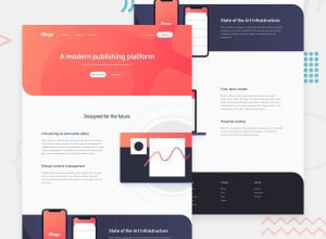
SolutionDesign

Solution retrospective
Hi everyone! i managed to complete this challenge!
My only concern is that the dropdown menu part has a lot of code to make it fit both the mobile and the desktop views, so it looks like there is something i'm missing
Is there any way to achieve the menu part with less code? do you recommend a framework like bootstrap to make this easier to tweak with?
Thank you all for the support!
Community feedback
Please log in to post a comment
Log in with GitHub
Join our Discord community
Join thousands of Frontend Mentor community members taking the challenges, sharing resources, helping each other, and chatting about all things front-end!
Join our Discord