Not Found
Not Found
Not Found
Not Found
Not Found
Not Found
Not Found
Not Found
Not Found
Not Found
Not Found
Not Found
Not Found
Not Found
Not Found
Not Found
Not Found
Not Found
Not Found
Not Found

All comments

  • @8NeoN8

    Posted

    The only details I can point out are the line height of the description, the font weight on the PERFUME label and the font size of the line through price and button text, the rest is perfect, good semantic html and responsive with the picture element and the multiple image sources, great work

    0
  • @WaRaGiSmYnIcKnAmE

    Submitted

    What challenges did you encounter, and how did you overcome them?

    While working on this solution, I learned how to work with unsorted lists and tables in css

    @8NeoN8

    Posted

    You do use semantic html although I would also use an article and sections for the ingredients, preparation, and nutrition, that for the html.

    Now on the design is all good but, on the css, going by what front end mentor shows, your css is not responsive past the differentiation between mobile and desktop, you should make at least 3-4 breakpoints counting the 2 that the challenge gives with 375px and 1440px, something like 840px and 1080px are a nice middle ground, and adjust the sizes to those, because as it shows the card stays the same size once it changes past the 375px mobile version, and it goes wide but not tall.

    As I said before that is what the comparator in frontendmentor shows, but your live site does occupy all the page, though yes the card stays the same size which it should grow a little bit since the text becomes to small

    0
  • @8NeoN8

    Posted

    Great work on the mobile design, but it seems it doesn't adjust to the desktop size/design, good that you used comments, but not that much semantic html, good on using <a> instead of <button> not like I did, but yeah design wise it seems you didn't make a responsive design for the solution, it works visually as a user but not for the requirements of the solution

    You can make the responsive design with a media-query in css:

    @media screen and (min-width: 1080){
      .yourClasses{
      }
    }
    

    Mobile first design is a good principle so no wrong there, but responsiveness should also be common practice to better the experience for all users

    0
  • @8NeoN8

    Posted

    The code does include semantic html but still wrapped inside divs, which is not necessary for every element due to the semantics part, but some can still be used inside a div for better control, like the <img>

    One improvement that I can tell you is sizes, the position of elements is perfect, but the size of the card changes all, to help with this what I do is create a <img> that has the design image as source, make it position absolute, put on the top left corner, and decrease its opacity and set the z-index high so that it always stays visible, the images already come at the correct sizes, and then you can follow the design with correct dimensions.

    example of the reference image:

    <img class="reference" id="reference" src="./design/desktop-design.jpg">
    

    then in css

    .reference{
      position: absolute;
      top: 0;
      left: 0;
      z-index: 10;
      opacity: 0.5;
    }
    

    That way the dimensions of the design will matchup better.

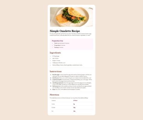
    Another little detail is the card border and the learning label. the border is a little thicker than the original and you had a typo on the learning label missing the capitalization on the L, the rest of the solution looks pretty great as I said perfect positions just missing the right dimensions

    0
  • Xavier O. 80

    @XavOli

    Submitted

    What challenges did you encounter, and how did you overcome them?

    First time using github, it tooks me a while to find out how to add/remove files and edit

    What specific areas of your project would you like help with?

    General tips on optimization.

    @8NeoN8

    Posted

    Almost perfect! Only thing is the difference in the subtext being a little more wide spread than the original, reducing the width of it's container can achieve the desired result, Good Job!

    Marked as helpful

    1