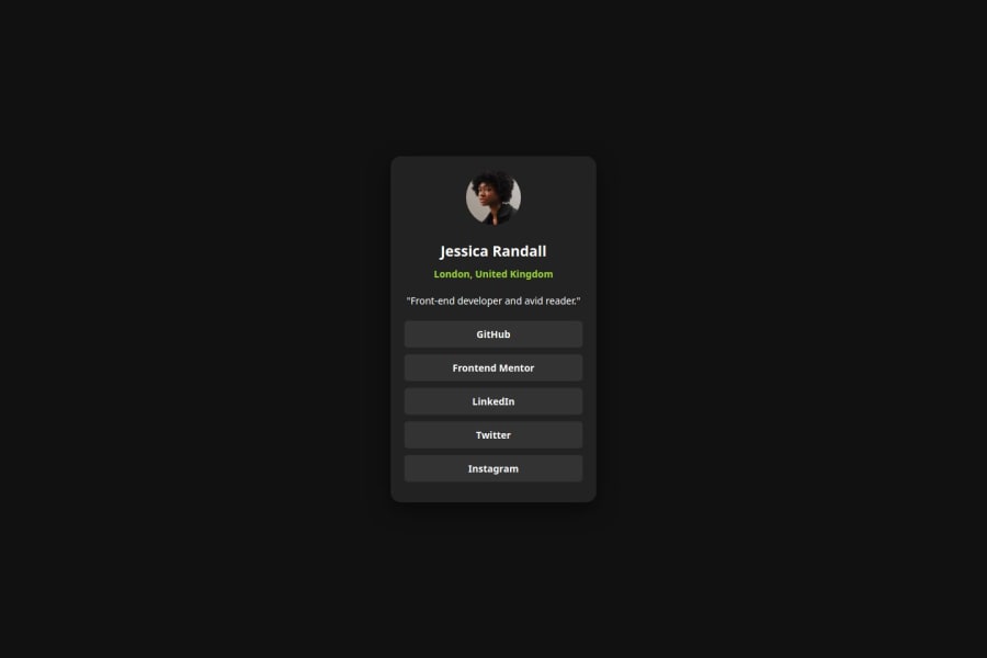


Design comparison
SolutionDesign

Community feedback
- @8NeoN8Posted 7 months ago
Great work on the mobile design, but it seems it doesn't adjust to the desktop size/design, good that you used comments, but not that much semantic html, good on using <a> instead of <button> not like I did, but yeah design wise it seems you didn't make a responsive design for the solution, it works visually as a user but not for the requirements of the solution
You can make the responsive design with a media-query in css:
@media screen and (min-width: 1080){
  .yourClasses{
  }
}
Mobile first design is a good principle so no wrong there, but responsiveness should also be common practice to better the experience for all users
0

Please log in to post a comment
Log in with GitHub
Join our Discord community
Join thousands of Frontend Mentor community members taking the challenges, sharing resources, helping each other, and chatting about all things front-end!
Join our Discord