Design comparison
SolutionDesign
Solution retrospective
What specific areas of your project would you like help with?
Any suggestions on how I can improve are welcome!
Community feedback
- @8NeoN8Posted about 2 months ago
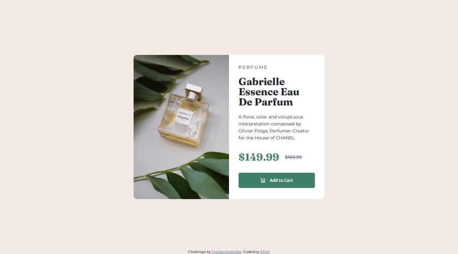
The only details I can point out are the line height of the description, the font weight on the PERFUME label and the font size of the line through price and button text, the rest is perfect, good semantic html and responsive with the picture element and the multiple image sources, great work
0
Please log in to post a comment
Log in with GitHubJoin our Discord community
Join thousands of Frontend Mentor community members taking the challenges, sharing resources, helping each other, and chatting about all things front-end!
Join our Discord
