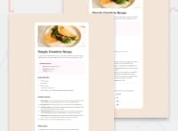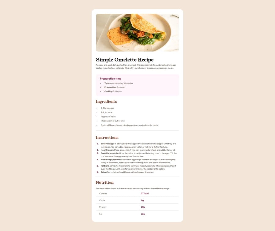
Design comparison
Solution retrospective
While working on this solution, I learned how to work with unsorted lists and tables in css
Community feedback
- @Israel-O-JohnPosted about 1 month ago
Thank you Your code gave me an idea on how to better my code
1 - @8NeoN8Posted about 1 month ago
You do use semantic html although I would also use an article and sections for the ingredients, preparation, and nutrition, that for the html.
Now on the design is all good but, on the css, going by what front end mentor shows, your css is not responsive past the differentiation between mobile and desktop, you should make at least 3-4 breakpoints counting the 2 that the challenge gives with 375px and 1440px, something like 840px and 1080px are a nice middle ground, and adjust the sizes to those, because as it shows the card stays the same size once it changes past the 375px mobile version, and it goes wide but not tall.
As I said before that is what the comparator in frontendmentor shows, but your live site does occupy all the page, though yes the card stays the same size which it should grow a little bit since the text becomes to small
0
Please log in to post a comment
Log in with GitHubJoin our Discord community
Join thousands of Frontend Mentor community members taking the challenges, sharing resources, helping each other, and chatting about all things front-end!
Join our Discord

