Not Found
Not Found
Not Found
Not Found
Not Found
Not Found
Not Found
Not Found
Not Found
Not Found
Not Found
Not Found
Not Found
Not Found
Not Found
Not Found
Not Found
Not Found
Not Found
Not Found

All comments

  • ElsaD 330

    @InKABuser

    Submitted

    What challenges did you encounter, and how did you overcome them?

    i had problems with sizing espicially on large screen and i also could not crop some of the images as it is in the design

    What specific areas of your project would you like help with?

    how to crop the "schedule to social media" image in the right?

    P

    @wonderlust101

    Posted

    Before using a reset CSS, you have to know what each style does. I learned this the hard way. This is the issue for your image not cropping:

      /*
        5. Improve media defaults
      */
      img, picture, video, canvas, svg {
        display: block;
        max-width: 100%;
      }


    The max-width: 100%; is preventing your image being larger than the container. I made this mistake as well a few weeks ago for another project. You can either unset it or change the value if you need a max-width.

    Example:

    .overflow-image {
    max-width: unset;
    }
    

    or

    .overflow-image {
    max-width: 30rem; // or whatever value you want
    }
    

    As for the image that need to crop past the bottom. Since you already have the overflow on the containers, we won't talk about that. Make the image position relative and add a top: [value] and a negative top-margin: [same value] to offset the difference. I'll take your code as an example:

    .posting-img {
        width: 75%;
        align-self: baseline;
        position: relative;
        top: 2rem;
        margin-top: -2rem;
    }
    

    This is specific to your code but you can unset margin-top at either tablet or desktop breakpoint using the same method to unset max-width and just set the value of top to what you need since your grid set the row height to the tallest container.

    Marked as helpful

    0
  • P
    vcollins1 410

    @vcollins1

    Submitted

    What are you most proud of, and what would you do differently next time?

    Creating the pop up to share the social links

    What challenges did you encounter, and how did you overcome them?

    when to use overflow hidden vs when not to use it.

    What specific areas of your project would you like help with?

    tips on using the CSS overflow property

    P

    @wonderlust101

    Posted

    Looks accurate to the design.

    As for overflow hidden, this is just a beginner's opinion but if you intent on having content going outside of the container other than the body, I wouldn't use overflow hidden. Otherwise, I would use it to make thing like components like these easier to code. However, in this component, using content overflow depends on where you put the popup in the html whether its in the container with the rest of the content or not.

    0
  • @EAguayodev

    Submitted

    What are you most proud of, and what would you do differently next time?

    I am most proud of the fact that I was able to correct the code in the footer and create a new section for the circles in the design after reviewing the code I wrote years ago when I first took on this challenge.

    What challenges did you encounter, and how did you overcome them?

    I've encountered some bugs on the mobile design where the screen allows for horizontal scrolls. Still in the works of figuring out the issue.

    What specific areas of your project would you like help with?

    I would definitely like help figuring out within my code where my issue to fix the horizontal scroll on the mobile design is explicitly happening.

    P

    @wonderlust101

    Posted

    I assume the horizontal scroll is because an element is wider than the viewport width. Instead of give fixed width to things, make the width responsive to the viewport width by using unit such as vw which corresponds to the viewport width or % which corresponds to the parent width.

    0
  • P

    @wonderlust101

    Posted

    based on the screenshot, it looks good but I can't get a closer look since the site is not found.

    0
  • P

    @cacesasa

    Submitted

    What are you most proud of, and what would you do differently next time?

    I'm most proud of the way I was able to incorporate the .svg file in my solution because this was the firts time using it as a background image, something that I thought was not posible. Next time I will try to not use absolute values to create the design.

    What challenges did you encounter, and how did you overcome them?

    Trying to incorparate the .svg file in the solution was a challenge for me, first I try to use it as an inline component in my HTML but when I tried to round the borders with css I realized it was not posible, and I started to look for a different solution to my problem, until I found out that I could use the image as a backgound image.

    What specific areas of your project would you like help with?

    I will love for some imput on how to make my code more compact. I think that I'm using too many lines of code to get to a solution.

    P

    @wonderlust101

    Posted

    What I notice is that you have some code that is either redundant or unnecessary. Fixing or removing those parts of your css will shorten your code significantly.

    For example, in this section , you don't need to put both max and min width/height when simply putting height and width will do. In addition, you grid will naturally fill the available horizontal space so you won't need width.

    Before:

    .card_wrapper{
        min-width: 100vw; // From this
        max-width: 100vw; // From this
        min-height: 100vh; // From this
        max-height: 100vh; // From this
        display: grid;
        justify-content: center;
        align-items: center;
    }
    

    After:

    .card_wrapper{
        height: 100vh;  // To this
        display: grid;
        justify-content: center;
        align-items: center;
    }
    

    Here you can just keep the width, the container will hug the height of the contents in the container.

    Before:

    .card {
        background: var(--primary-color-white);
        display: grid;
        min-width: 327px; //  From this
        max-width: 327px; //  From this
        min-height: 501px; //  From this
        max-height: 501px; //  From this
        border-radius: 20px;
        border: 1px solid black;
        box-shadow: 8px 8px 0px 0px rgba(0,0,0,1);
        padding: 24px;
    }
    

    After:

    .card {
        background: var(--primary-color-white);
        display: grid;
        width: 327px; //  To this
        border-radius: 20px;
        border: 1px solid black;
        box-shadow: 8px 8px 0px 0px rgba(0,0,0,1);
        padding: 24px;
    }
    

    Once you clean this up, the four lines of code setting height and width will turn to one or two lines of code. This is not every but hopefully this gives you a clear idea on what you need to fix.

    Have fun coding 😊.

    Marked as helpful

    0
  • P

    @ValsCodes

    Submitted

    What are you most proud of, and what would you do differently next time?

    I got somewhat of a better idea on how to size things properly

    What challenges did you encounter, and how did you overcome them?

    Sizing the design with units like rem, em, svh and github pages wasn't in the mood to work that day :)

    What specific areas of your project would you like help with?

    I would love to get some straight guidelines on how to size things, since the Figma Design says one thing and I hear all kinds of other suggestions.

    How much should I trust Figma with the parameters it suggests?

    P

    @wonderlust101

    Posted

    This is not much a guideline but a personal opinion from a person who regularly uses Figma. You can trust the parameters IF the website design is static and will never change.

    However, as you know, as coders, we must make the design responsive and accessible, so that many people from all over the world with unique devices whether its a phone or a computer can access the site/design/game or whatever.

    So when looking at Figma and its parameters, you can use the values but maybe when you look at it, instead of using width: 40rem from Figma for example, you can use max-width: 40rem or width: (95%, 40rem) to make it more responsive. Also, Figma tends to make everything display: flex when the solution could be better solved as a display: gird.

    There are several YouTuber the I recommend on improving CSS but the one that I always recommend is Kevin Powell. He also has videos where he codes designs from this site so I can recommend him if you want so tips on CSS.

    TL;DR: You can reference the values but don't copy everything that Figma puts for better responsiveness and accessibility.

    0
  • @olivervillalobos

    Submitted

    What are you most proud of, and what would you do differently next time?

    I've managed to use grid and flex in the same page which is something I used to struggle a lot with.

    What challenges did you encounter, and how did you overcome them?

    The placing of the cards was tricky, although Im pretty sure the way I did it is not the correct one.

    What specific areas of your project would you like help with?

    I would like suggestions about how to place the cards appropiately.

    P

    @wonderlust101

    Posted

    I think your on the right track, a nicer solution that I found online was using grid-template-areas. This is what my solution looked like for main:

    .featured-cards-grid {
      display: grid;
      grid-template-areas:
        'a'
        'b'
        'c'
        'd';
      gap: 30px;
      max-width: min(95%, 69.375rem);
    
      @include a.breakpoint(medium) {
        grid-auto-columns: 1fr;
        grid-auto-rows: 1fr;
        grid-template-areas:
                '. b .'
                'a b d'
                'a c d'
                '. c .';
      }
    
      // Sets a grid area for grid children
      & > :nth-child(1) {grid-area: a;}
      & > :nth-child(2) {grid-area: b;}
      & > :nth-child(3) {grid-area: c;}
      & > :nth-child(4) {grid-area: d;}
    }
    

    You have more control on where the children of the main goes. Obviously that just one solution, there are many other solutions. I recommend either going with the one your comfortable with or if you want to challenge yourself use the one your not comfortable with.

    0
  • Moises2710 190

    @Moises2710

    Submitted

    What are you most proud of, and what would you do differently next time?

    I did this challenge in march, I proud because I can be better.

    What challenges did you encounter, and how did you overcome them?

    I didn't encounter this challenges.

    What specific areas of your project would you like help with?

    I would like to receive help in my skills about responsive design.

    P

    @wonderlust101

    Posted

    In terms of responsive design, the only this I would suggest is using max-width instead of just width when you are using fixed values so that your content won't overflow on smaller screens.

    In the future, avoid using px for things that should scale when users change their browser font size such as width, height, font size, etc. just to name a few. There should be a Youtube video somewhere that talks more about this.

    Additionally, start using semantic HTML for accessibility purposes.

    0
  • P

    @jguleserian

    Submitted

    What are you most proud of, and what would you do differently next time?

    Greetings, Everyone!

    Thank you for taking the time to take a look at my work and give me some feedback. I know your time is valuable, so I am grateful for you critical eye and subsequent suggestions.   While much of this project was straight forward, I did find some challenges with formatting the bullet points correctly. I feel happy that I was able to get a better sense on how to manipulate them more competently. In addition, this was the first project that I took advantage of HTML ``, and I think it worked out pretty well.

    Finally, I feel like I am more comfortable with GitHub, although it still makes me want to pull out what's left of my hair, as I explain below.

    What challenges did you encounter, and how did you overcome them?

    My first challenge was the formatting of bullet points. I don't know why this has eluded me so much. The problem comes in trying to create an li::before in the CSS. Once the source is referenced, the problem has been getting the bullet point to sit correctly on the line to match the text to the right. I had to resort to negative margins to help put it in the right place.

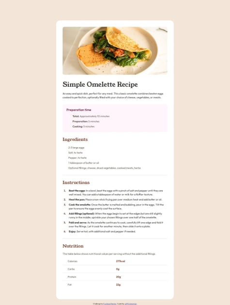
    My second challenge, as has been consistent with several projects I've done, is my struggle with GitHub. While it is a wonderful tool, I notice that when everything looks good launching my site from VS Code, the same code launched from GitHub may have things missing. This usually occurs when a resource is found in another folder, such as the elipse (used for the bullet point), as referenced in the stylesheet as a "content" resource. It also seems to occur elsewhere, but this is where I noticed it this time. Sometimes taking off the forward slash, /, solves the issue, but sometimes it does not. Got this reason, if you look at the solution on GitHub, two sections are missing the bullet points, but you will of course see them in the screenshot I provided.

    Anyway, if anyone has any help with respect to either of these, I would greatly appreciate it, especially navigating the labyrinth of GitHub pages.

    What specific areas of your project would you like help with?

    As mentioned above, I would be so grateful if someone could take a look at my code and let me know how I can improve, in any area, but specifically with respect to the bullet points and GitHub.

    Thank you so much for taking a look at my submission. I appreciate any encouragement or insight.

    Happy coding!

    P

    @wonderlust101

    Posted

    Regarding your second challenge, the path for the SVG is not correct. From what I see in github, you structure your files like this:

    :root
    |assets/
    |--images/
    |---- ellipse.svg
    |styles/
    |--styles.css
    |index.html
    |ellipse.svg     (another copy assume)
    

    Right now in your CSS you got:

    content: url("/assets/images/ellipse.svg");
    

    Which assume that there is a folder is styles like below (which is not):

    :root
    |assets/
    |--images/
    |---- ellipse.svg
    |styles/
    |--assets/
    |----images/
    |------ ellipse.svg
    |--styles.css
    |index.html
    |ellipse.svg
    

    What you need to do is to direct it backwards by using ../ which will result your code looking like this:

    content: url("../assets/images/ellipse.svg");
    

    This applies to many coding languages if your dealing with files management. You can also stack them to access nested folders like this:

    ("../../../path/to/file/file.js");
    

    Hopefully that helped and wasn't confusing.

    Regarding your first challenge, I don't know much about it so hopefully someone corrects me if what I say is true or not. The SVG anchor points are usually in the top-left so I assume that's the reason why it shifted down. There has been a few times where I coded some 2D games and I had to shift it to be centered properly so maybe that's the reason. Again, I don't entirely know why but that's my assumption.

    EDIT: I'm also not entirely sure why your able to see your markers on VS Code since I don't use it. It might be a setting or something.

    Marked as helpful

    0
  • @HovenWebdesign

    Submitted

    What are you most proud of, and what would you do differently next time?

    I tried to use modern css to create the card. I would like to get feedback on design, usage of html and css. If you have any other feedback, I would like to hear it too.

    P

    @wonderlust101

    Posted

    Looks good but a little tip in the future if you decide to use a reset.css or normalize.css. You can use:

    width: min(xrem, 90%); //Where x = size of container
    

    What this does is choose the lowest value of the two. This means that on wide monitors it will be equal to:

    width: xrem; //Where x = size of container
    

    and on smaller monitors it will be like:

    max-width: 90%; 
    

    While it only saves you from writing one line, its still pretty useful in other applications outside of container width. Its compatible all browser except IE but if you care about accessibility, I recommend not using it.

    Browser Support: https://caniuse.com/?search=min

    Source: Kevin Powell - Youtube

    Marked as helpful

    0
  • P
    gajbos99 170

    @gajbos99

    Submitted

    What are you most proud of, and what would you do differently next time?

    Having an (in my opinion) responsive card component

    What challenges did you encounter, and how did you overcome them?

    At first i wasnt sure how to use the different images.

    What specific areas of your project would you like help with?

    Any help or tips would be appreciated.

    P

    @wonderlust101

    Posted

    While you did use rem for your fonts, which is good, you can still add rem to other things so that everything scale proportionately.

    To test this, go to your browser settings and change the font size. You will see that your font will change, but everything will be squished and not scale.

    0
  • P

    @josifermaodev

    Submitted

    What are you most proud of, and what would you do differently next time?

    I'm proud to have managed to come up with such a similar replica with so little experience!

    What challenges did you encounter, and how did you overcome them?

    I had a little difficulty aligning the last section of the card, but with a lot of persistence and research I managed to resolve it.

    What specific areas of your project would you like help with?

    I would like help with the classes, because I believe I can still improve a lot, I feel like my code is not completely clean. Any feedback is very important to help me improve my Development!

    P

    @wonderlust101

    Posted

    Ensure you are consistent with your unit. You code has both px and rem for things sure as font size.

    Also, whether to choose rem and px depends on your need. For more responsive elements or properties such as fonts, media queries, width etc., choose em, for fixed elements such as border or box-shadow, choose px.

    I got this information from Kevin Powell, he has a lot of educational content about css. This video is where I got my info: https://www.youtube.com/watch?v=Utc_uhvTluk&t=885s

    0