Not Found
Not Found
Not Found
Not Found
Not Found
Not Found
Not Found
Not Found
Not Found
Not Found
Not Found
Not Found
Not Found
Not Found
Not Found
Not Found
Not Found
Not Found
Not Found
Not Found

Submitted

Blog preview card challenge.

P

@cacesasa

Desktop design screenshot for the Blog preview card coding challenge

This is a solution for...

  • HTML
  • CSS
1newbie
View challenge

Design comparison


SolutionDesign

Solution retrospective


What are you most proud of, and what would you do differently next time?

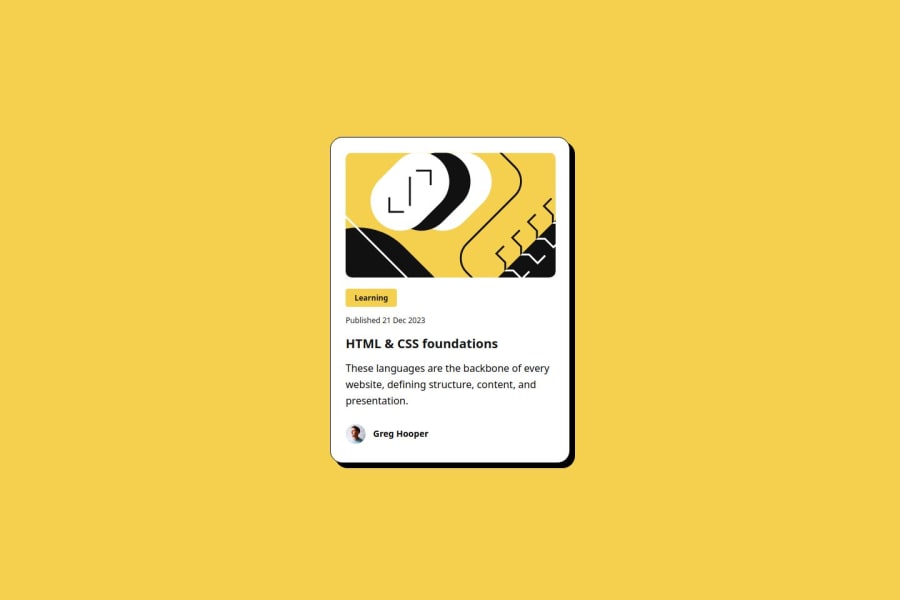
I'm most proud of the way I was able to incorporate the .svg file in my solution because this was the firts time using it as a background image, something that I thought was not posible. Next time I will try to not use absolute values to create the design.

What challenges did you encounter, and how did you overcome them?

Trying to incorparate the .svg file in the solution was a challenge for me, first I try to use it as an inline component in my HTML but when I tried to round the borders with css I realized it was not posible, and I started to look for a different solution to my problem, until I found out that I could use the image as a backgound image.

What specific areas of your project would you like help with?

I will love for some imput on how to make my code more compact. I think that I'm using too many lines of code to get to a solution.

Community feedback

P

@wonderlust101

Posted

What I notice is that you have some code that is either redundant or unnecessary. Fixing or removing those parts of your css will shorten your code significantly.

For example, in this section , you don't need to put both max and min width/height when simply putting height and width will do. In addition, you grid will naturally fill the available horizontal space so you won't need width.

Before:

.card_wrapper{
    min-width: 100vw; // From this
    max-width: 100vw; // From this
    min-height: 100vh; // From this
    max-height: 100vh; // From this
    display: grid;
    justify-content: center;
    align-items: center;
}

After:

.card_wrapper{
    height: 100vh;  // To this
    display: grid;
    justify-content: center;
    align-items: center;
}

Here you can just keep the width, the container will hug the height of the contents in the container.

Before:

.card {
    background: var(--primary-color-white);
    display: grid;
    min-width: 327px; //  From this
    max-width: 327px; //  From this
    min-height: 501px; //  From this
    max-height: 501px; //  From this
    border-radius: 20px;
    border: 1px solid black;
    box-shadow: 8px 8px 0px 0px rgba(0,0,0,1);
    padding: 24px;
}

After:

.card {
    background: var(--primary-color-white);
    display: grid;
    width: 327px; //  To this
    border-radius: 20px;
    border: 1px solid black;
    box-shadow: 8px 8px 0px 0px rgba(0,0,0,1);
    padding: 24px;
}

Once you clean this up, the four lines of code setting height and width will turn to one or two lines of code. This is not every but hopefully this gives you a clear idea on what you need to fix.

Have fun coding 😊.

Marked as helpful

0

P

@cacesasa

Posted

@wonderlust101 Thank you for taking the time to review my code, your comments are really helpful. I will implement your changes to the solution and future ones too.

0

Please log in to post a comment

Log in with GitHub
Discord logo

Join our Discord community

Join thousands of Frontend Mentor community members taking the challenges, sharing resources, helping each other, and chatting about all things front-end!

Join our Discord