When the Lightbox overlay appears , the contents of it are placed far for each other(the large image, the thumbnails and the close icon) - the gap between them should be reduced.
The next icon the Lightbox overlay is not placed correctly.
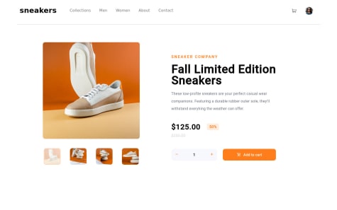
In mobile view you can increase the cart icon size. 😄👍
To reduce the gap between the product image and the product details in the dekstop version.
The border radius on the "Add to Cart" button is too much which doesn't look good, can try to reduce it.
When clicking on the nav-link, the active state effect width extends too much, it should take up width that's same as the text of the nav-link, maybe you can add it as a hover effect as well. 😄👍