Not Found
Not Found
Not Found
Not Found
Not Found
Not Found
Not Found
Not Found
Not Found
Not Found
Not Found
Not Found
Not Found
Not Found
Not Found
Not Found
Not Found
Not Found
Not Found
Not Found

Submitted

cart e-commerce product

@lapinRagnar

Desktop design screenshot for the E-commerce product page coding challenge

This is a solution for...

  • HTML
  • CSS
  • JS
3intermediate
View challenge

Design comparison


SolutionDesign

Solution retrospective


Thanks!

Community feedback

@swagataroy30

Posted

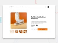
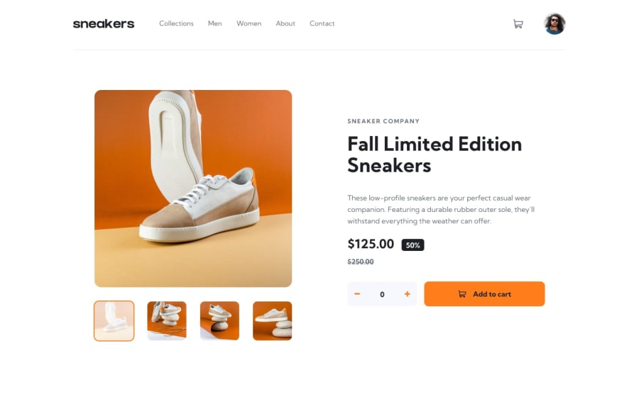
Other suggestion would be:-

  1. To reduce the gap between the product image and the product details in the dekstop version.
  2. The border radius on the "Add to Cart" button is too much which doesn't look good, can try to reduce it.
  3. When clicking on the nav-link, the active state effect width extends too much, it should take up width that's same as the text of the nav-link, maybe you can add it as a hover effect as well. 😄👍
0
S MD suleman 3,530

@sulemaan7070

Posted

hey lapinRagnar😄, congratulations on completing the challenge... here are a few tips to make your site better.

1.Firtsly the background color of the site is not pleasing the eyes.. you can change that..

2.and the four thumnails on the main image should be placed below the main-image.

happy coding👍

0

Please log in to post a comment

Log in with GitHub
Discord logo

Join our Discord community

Join thousands of Frontend Mentor community members taking the challenges, sharing resources, helping each other, and chatting about all things front-end!

Join our Discord