steevencode
@steeven509All comments
- @leonardocampos19Submitted almost 2 years ago@steeven509Posted almost 2 years ago
Hello @Leonardo Campos , I hope everything is okay for you ?
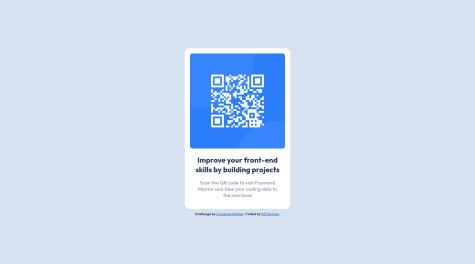
I'm really impressed with the design it's so close to the original However i have small notes for you: *Your accessibility has a lot of warnings you need to fix them *You must use semantic tags *Improve the alternative text of the QR code by describing the purpose of the QR code. "QR code to frontendmentor.io" can be a good alternative text for it. *Use a CSS reset whenever you start a new project. This can help you set the styling foundation easily. My recommendation — A Modern CSS Reset *Never limit the height of the <body>. It will not allow the users to scroll the page when the page content needs more height. Try to look at the site on a mobile landscape view to see the issue. So, use min-height: 100% instead. *Never use px unit for font sizes. Use rem or em instead. Relative units such as rem and em can adapt when the users change the browser's font size setting.
I hope you find this useful. 🙂
Marked as helpful1 - @alansouza7Submitted over 2 years ago@steeven509Posted over 2 years ago
Hi, I have not checked your source code yet but the report indicates that you have a accessibility problem, if this feedback has helped you mark it as util thanks you
0 - @hafsabnSubmitted over 2 years ago
I really have a big problem in position the text in the same line with images that's why i am not sure in my code especially in the areas where there are a text and a picture in front of it . So if there are some resources or practices to learn more in this subject please let me know and thanks.
@steeven509Posted over 2 years agoHi, I have not checked your source code yet but the report indicates that you have a lot of accessibility problem, if this feedback has helped you mark it as util thanks you
0 - @elifseyhanSubmitted over 2 years ago@steeven509Posted over 2 years ago
Hi, I have not checked your source code yet but the report indicates that you have a lot of accessibility problem, if this feedback has helped you mark it as util thanks you
0 - @phoenixrxSubmitted over 2 years ago
L COULDN'T MAKE THE BACKGROUNG LOOKS LIKE THE ORIGINAL :(
@steeven509Posted over 2 years agoHi, I have not checked your source code yet but the report indicates that you have a lot of accessibility problem, if this feedback has helped you mark it as util thanks you
0 - @DityathSubmitted over 2 years ago
Hi, this is my Advice Generator App, created with Vite and React.js. With Axios and Framer-Motion.
Any feedbacks are welcome!
- @ralvarezrenzoSubmitted over 2 years ago
Any comments to improve are welcome, greetings good code.
@steeven509Posted over 2 years agoHi, I have not checked your source code yet but the report indicates that you have a accessibility problem, if this feedback has helped you mark it as util thanks you
0 - @preciousyaks17Submitted over 2 years ago
I would appreciate any form of feedback, in order to do better and improve my skills.
@steeven509Posted over 2 years agoHi, I have not checked your source code yet but the report indicates that you have a lot of accessibility problem, if this feedback has helped you mark it as util thanks you
0 - @Sonu-DuttaSubmitted almost 3 years ago
- @Sonu-DuttaSubmitted almost 3 years ago@steeven509Posted almost 3 years ago
Hello Sonu check the report there really is a lot to learn and design on mobile is unresponsive
I did not check your source code
0 - @carogullonSubmitted almost 3 years ago@steeven509Posted almost 3 years ago
Hola, esto es muy bueno, pero mira los problemas de accesibilidad que veo que tienes. Para solucionar este problema aquí hay un enlace que explica todo.
https://dequeuniversity.com/rules/axe/4.3/landmark-one-main?application=axeAPI
Para tu información, olvidaste los pesos de las fuentes
0 - @alana-nanzSubmitted almost 3 years ago


