Design comparison
Community feedback
- @zeerobitPosted almost 3 years ago
Good work tackling and completing this challenge, here are a few pointers:
- as @steevencode mentioned the mobile design is not responsive, you should revise your media query
- no need to set a height on your ".testimonials-section" class
- revise your grid properties for the mobile design, you should not have to span columns to 4 for mobile size below 375px or even above since it can't fit this many column
- look up grid area it'd make it a lot easier for this challenge, check out this grid area tutorial
- the report indicates you have many issues in your html since you use section tag it's expecting each section to have a header . The correct semantics for this challenge would be
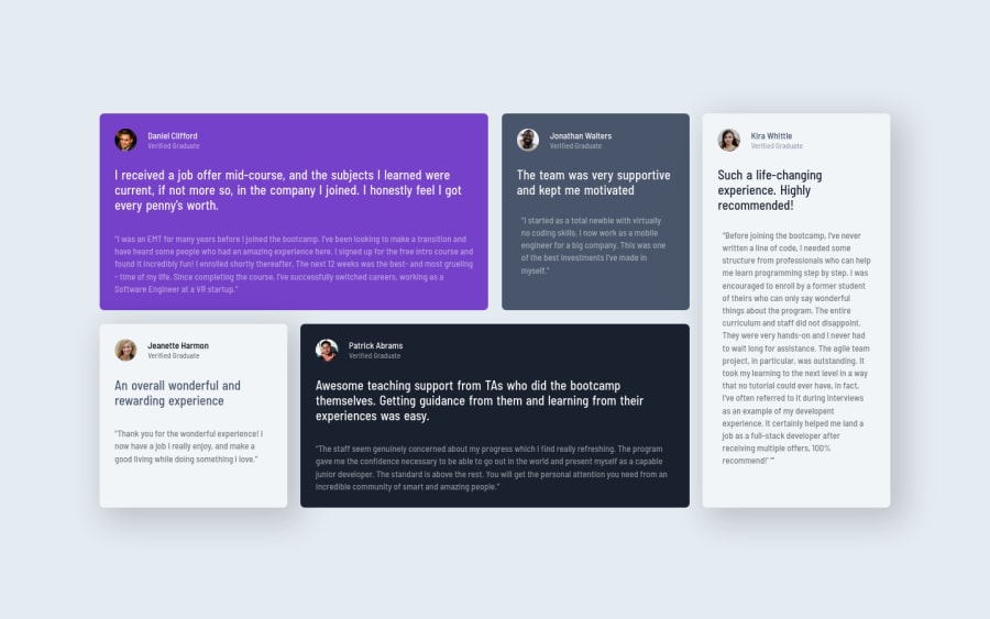
figureto wrap the content for each card,figcaptionfor the author section andblockquoteto wrap the paragraphs - Nothing wrong with a desktop first approach design but I usually recommend mobile first since it makes it a lot easier to design and it can save you a lot on css
Hope this helps, happy coding !!!
Marked as helpful1@Sonu-DuttaPosted almost 3 years ago@zeerobit thank you so much , I would definitely try to work on it 😊
0@Sonu-DuttaPosted almost 3 years ago@zeerobit do we need to mention (figure , figcaption , blockquote) is it compulsory for the challenge?
0@zeerobitPosted almost 3 years agobasically it's not about it being compulsory for this specific challenge, it's more about structuring html using proper semantics however these elements can be applied to any other challenge where they fit. Others have used the article element to wrap the card content for this challenge but i think the figure element is semantically more aligned with the context of this challenge
0 - @rohitKumar38344Posted almost 3 years ago
Your need to use background property to section-1 instead of background-image for short hand background: url("path of image") no-repeat; otherwise you can also use specific css properties for background like background-image, background-repeat, and then apply background-position property to position the image, otherwise you did great work To know more: https://developer.mozilla.org/en-US/docs/Web/CSS/background-image
Marked as helpful0@Sonu-DuttaPosted almost 3 years ago@rohitKumar38344 thank you for your suggestions👍😊
0 - @steeven509Posted almost 3 years ago
Hello Sonu check the report there really is a lot to learn and design on mobile is unresponsive
I did not check your source code
0@Sonu-DuttaPosted almost 3 years ago@steeven509 okay ,I will definitely try to work on it! thank you for the feedback 😊
0
Please log in to post a comment
Log in with GitHubJoin our Discord community
Join thousands of Frontend Mentor community members taking the challenges, sharing resources, helping each other, and chatting about all things front-end!
Join our Discord
