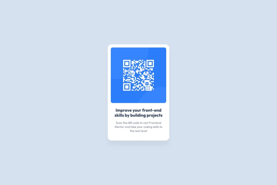
Design comparison
Community feedback
- @steeven509Posted almost 2 years ago
Hello @Leonardo Campos , I hope everything is okay for you ?
I'm really impressed with the design it's so close to the original However i have small notes for you: *Your accessibility has a lot of warnings you need to fix them *You must use semantic tags *Improve the alternative text of the QR code by describing the purpose of the QR code. "QR code to frontendmentor.io" can be a good alternative text for it. *Use a CSS reset whenever you start a new project. This can help you set the styling foundation easily. My recommendation — A Modern CSS Reset *Never limit the height of the <body>. It will not allow the users to scroll the page when the page content needs more height. Try to look at the site on a mobile landscape view to see the issue. So, use min-height: 100% instead. *Never use px unit for font sizes. Use rem or em instead. Relative units such as rem and em can adapt when the users change the browser's font size setting.
I hope you find this useful. 🙂
Marked as helpful1@leonardocampos19Posted almost 2 years ago@steeven509 Hey thank you very much. I'll do these fixes when I have the time
0
Please log in to post a comment
Log in with GitHubJoin our Discord community
Join thousands of Frontend Mentor community members taking the challenges, sharing resources, helping each other, and chatting about all things front-end!
Join our Discord
