@laachouch8Submitted over 2 years ago
I'm waiting better solution or tips and thanks

I'm waiting better solution or tips and thanks
@laachouch8, You solution looks great 😄
I have some tips to improve it,
<body> with <main> tag to avoid accessibility issueThese are some tips i have for you, hope it helps
I had a bit of a challenge making the background pattern responsive. Not sure my 'solution' to making the background pattern responsive was the best one. Would appreciate your feedback
Hi, Jonathan
No, i don't think there is another way around it. since, the background image are big we are forced to use background-size and background-position to position accordingly.
But, it would be better if you use viewport vw units instead of px so it will be more responsive!
Check out: my solution
Hope that resolves your question.
Hi all, Here is my NFT Preview Card Component project done in angular. Waiting for your valuable feedback on this.
Thanks
Hi Athira, Good work on your first angular project in frontendmentor!
I have some tips to improve your code,
<main> tag to avoid accessibility issue.<div> tag instead of <span> for element with class "detail","eth","time"display: flex with align-items: center in "eth","time" and footer to vertically center the image and text.<span class="name"> element.min-height: 100vh; in <main> tag to vertically center the card.Addressing the use <div> instead of <span>, we generally use <span> as a "leaf node" means that it doesn't have other childNode except the textNode. it's a best practice
Hopefully you find these suggestion helpful 😊
I struggled while adjusting text in the box.
Hi Nikhil, good work in your first challenge.
I have some suggestion which might be helpful,
.container {
  display: flex;
  flex-direction: column;
  gap: 1.5em;
}
Here, we are changing the flex direction to "column" i.e vertically and adding a gap of "1.5em" (or some else) between flex items.
Then, remove display: inline-block; & position: fixed in p#p1 & p#p2 and adjust margin & padding accordingly.
Happy Coding and Good luck on your frontend journey
How did you all go about doing the cards background colors? No matter what I tried I couldn't make it match the design image with the colors they gave.
Hi Andy, I used radial-gradient() for the background which looks close to the design
.card {
    background-image: radial-gradient(circle at top,hsl(210, 19%, 18%) 0%,hsl(215, 23%, 14%) 50%, hsl(215, 27%, 12%) 100%);
}
Check: https://www.frontendmentor.io/solutions/interactive-rating-component-with-vanilla-js-sass-3UZIEGY9H
Hopefully, that solves your query.
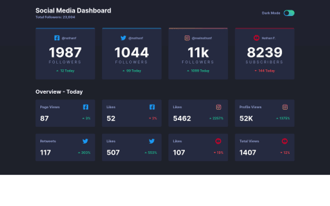
Create a responsive social media dashboard for all screens, I'm here for tips.
As @besttlookk mentioned, The white space at the bottom of the screen is because of the content of the page (height required) is less than the screen's height or viewport's height.
We can resolve this issue by adding a min-height: 100vh; to the <section class="section"> tag
and overall your design and transition between theme looks good!
Hi there, good work on your solution
Your solution is almost perfect but there are some issue in your code,
.body-card as there is a visual difference between the background color and the card's bg color.margin-top: 40px on .body-card use display: grid; with place-content: center; on the body will automatically center it.NOTE: set min-height: 100vh on the body for the (2) feedback to take effect.
Hey friends , here is my third frontendmentor project. it's fun to build stuff. Please take a look at my solution. you feedback is valuable to me. thank you.
Nice work on your solution!
Regarding the accessibility issue, change the <div class="attribution"> to <footer class="attribution"> with corresponding closing tags will resolve it.
Overall, Good work and Gook luck on your frontend journey.
What I find difficult building the project was understanding this instruction
"The designs were created to the following widths:
I'm not sure whether to use media query or just "max-width" the parent container.
What do you think ?
Hi Archerking47, Good work on your project.
No, you need not use media queries or max-width on the container since here the card have fixed dimension so just using display: grid on the parent container with place-content: center will be fine.
And regarding the accessibility issue wrapping the card element with a main tag will resolve it.