Design comparison
Solution retrospective
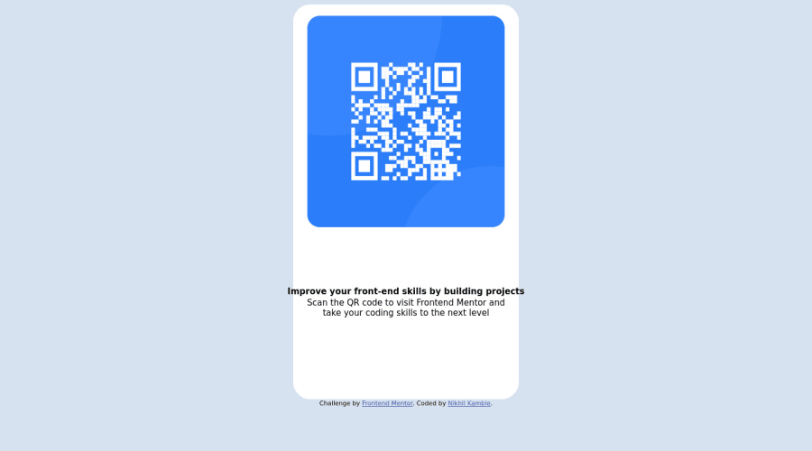
I struggled while adjusting text in the box.
Community feedback
- @solvedbiscuit71Posted over 2 years ago
Hi Nikhil, good work in your first challenge.
I have some suggestion which might be helpful,
- Change <p id="p1"> to <h1> and <p id="p2"> to <p> to simplify and avoid accessiblity issue!
- For your text align issue
.container {
  display: flex;
  flex-direction: column;
  gap: 1.5em;
}
Here, we are changing the flex direction to "column" i.e vertically and adding a gap of "1.5em" (or some else) between flex items.
Then, remove
display: inline-block;&position: fixedin p#p1 & p#p2 and adjust margin & padding accordingly.Happy Coding and Good luck on your frontend journey
0 - @Rk44-githubPosted over 2 years ago
Put your text in a div and the use display: flex to and align-items: center or text-align: center this should work. Just take a short tutorial on flex-box from youtube, if you are not used to it. Also add positioning to the attributes, use position: absolute bottom: (a value to make it stick to the bottom). Try these.
0
Please log in to post a comment
Log in with GitHubJoin our Discord community
Join thousands of Frontend Mentor community members taking the challenges, sharing resources, helping each other, and chatting about all things front-end!
Join our Discord
