Submitted over 2 years ago
Creating social media dashboard using Grid and Js
@laachouch8
Design comparison
SolutionDesign
Solution retrospective
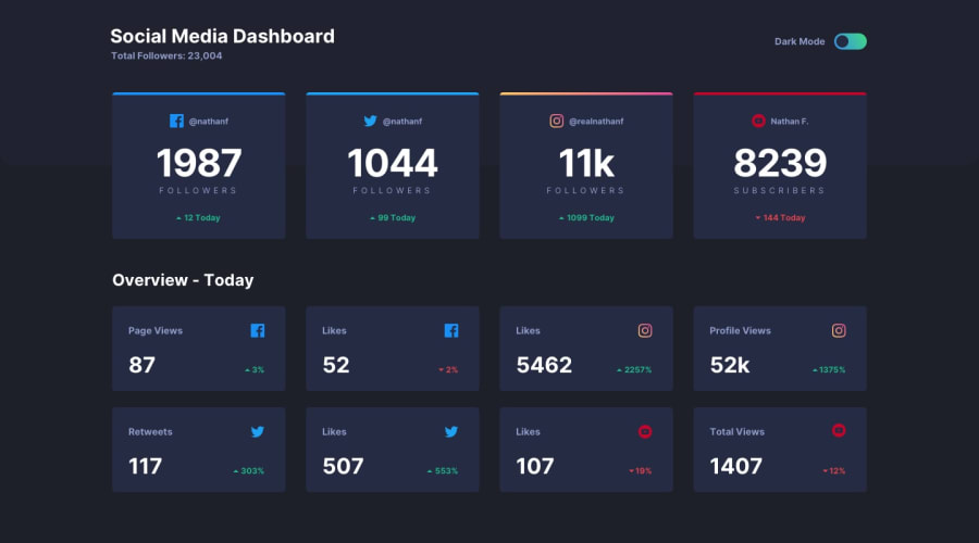
Create a responsive social media dashboard for all screens, I'm here for tips.
Community feedback
- @solvedbiscuit71Posted over 2 years ago
As @besttlookk mentioned, The white space at the bottom of the screen is because of the content of the page (height required) is less than the screen's height or viewport's height.
We can resolve this issue by adding a
min-height: 100vh;to the<section class="section">tag and overall your design and transition between theme looks good!Marked as helpful2@solvedbiscuit71Posted over 2 years agoSure did! Great work man
Marked as helpful0 - @besttlookkPosted over 2 years ago
Only issue i found is , when in dark mode..there is some area of white at the botttom (for larger screen.
Apart from that everything looks great.
Marked as helpful0
Please log in to post a comment
Log in with GitHubJoin our Discord community
Join thousands of Frontend Mentor community members taking the challenges, sharing resources, helping each other, and chatting about all things front-end!
Join our Discord
