Latest solutions
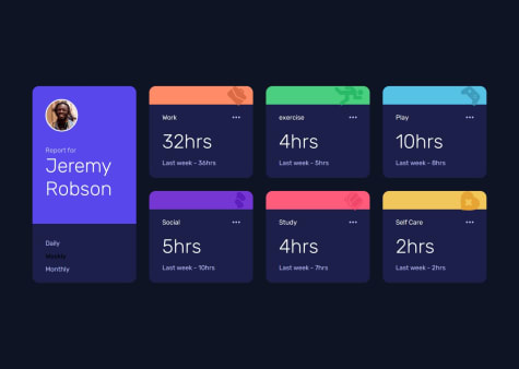
Frontend Mentor - Time tracking dashboard
#tailwind-cssSubmitted 11 months agoI need more guidance and reference in terms of Javascript, so I will go for the OOP approach later on.
Frontend Mentor - Newsletter sign-up form - TailwindCSS - Javascript
#tailwind-cssSubmitted 11 months agoI like to write clean code, fast easy and I made lots of ID selectors, may be there is a more efficient way than making a whole bunch of ID selectors.
Article preview component - TaiwindCSS and Javascript
#tailwind-cssSubmitted 12 months agoI want to develop faster with Tailwind, Also I like to have a better naming approach in Javascript and write more readable code.
Meet landing page
#bemSubmitted 12 months agoI Cheated on BEM naming because I didn't want an extra long CSS class name, I welcome any opinion.
Testimonials grid section - CSS Grid
#bemSubmitted 12 months agoI like to apply SASS to my projects but I didn't, so I think I need a good recommendation for how to apply SASS/SCSS to my projects.
Four card feature section
#bemSubmitted 12 months agoI like to know how it's works, if you use CSS grid, but it's more simple to use Flexbox for this layout.
Latest comments
- @808NVSubmitted about 1 year ago@smhnfreelancerPosted 11 months ago
Congrats! The screenshot shows that there are some minor CSS changes needed. But both the code and the live website links are broken, you can fix it.
0 - @jjdavenportSubmitted 11 months agoWhat are you most proud of, and what would you do differently next time?
Discovering object fit to use with the page images.
What challenges did you encounter, and how did you overcome them?When the validation fails and the error state is displayed, my moves up about one pixel and i still have not found how to fix this.
What specific areas of your project would you like help with?Feedback regarding the validation aspect and my JS in general.
@smhnfreelancerPosted 11 months agoNice work!
- The JS Working Perfectly.
- You can do the mobile view as well.
- When the email is invalid the input border also changes to the tomato color.
- Also I saw that you assign colors and other values in Javascript, a better approach is to add or remove a specific CSS class. Regards
Marked as helpful1 - @RaulTindoganSubmitted 12 months agoWhat specific areas of your project would you like help with?
It would be a big help if you give some feedback on what areas of this project that I can improve.
@smhnfreelancerPosted 12 months agoHi Congragulations on completing the task. On the mobile screen, you need to apply the gray bluish background color. regards
1 - @TaruHamalainenSubmitted almost 2 years ago@smhnfreelancerPosted 12 months ago
Congrats! it's amazing, but I want to mention some points:
- set the body's background color to
background: #FAFAFA;. - "Experience more together" and "Stay connected with..." in desktop mode are left aligned.
- "Built for modern use"
font-sizeis16pxand it's all caps. - Hero images need to be slightly about
20pxout of the browser's viewport, you can simply useobject-positionfor that matter
Again, your design is amazing. Regards
0 - set the body's background color to
- @mdjgithub123Submitted about 1 year ago@smhnfreelancerPosted 12 months ago
Hi, I don't see any results, but a few points for making the project.
- take everything easy, there is no need to be pixel-perfect, and the code is more important.
- Use online resources like cheatsheets to understand the CSS grid.
- Use the style-guide.md file to find the fonts and also colors.
- Use KISS principle and make the project as easy as you can.
0 - @ThiagoTelheiroSubmitted about 1 year agoWhat specific areas of your project would you like help with?
Dicas são bem vidas !
@smhnfreelancerPosted 12 months agoCongrats! it's amazing, but a few points to mention:
- The line-through text font is Montserrat not Fraunces with about
0.8remas a font-size. - For the main text
line-height:23pxis more closer to the original design. - The size of the Add to Cart button is not changing on the hover, this is flat, minimalist design.
- Also the mobile view design is not applied. Regards
1 - The line-through text font is Montserrat not Fraunces with about


