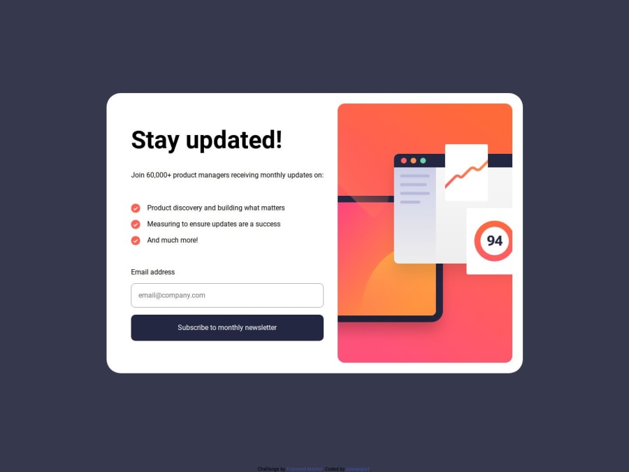
Design comparison
SolutionDesign
Solution retrospective
What are you most proud of, and what would you do differently next time?
Discovering object fit to use with the page images.
What challenges did you encounter, and how did you overcome them?When the validation fails and the error state is displayed, my moves up about one pixel and i still have not found how to fix this.
What specific areas of your project would you like help with?Feedback regarding the validation aspect and my JS in general.
Community feedback
Please log in to post a comment
Log in with GitHubJoin our Discord community
Join thousands of Frontend Mentor community members taking the challenges, sharing resources, helping each other, and chatting about all things front-end!
Join our Discord
