
@JoelJohsSubmitted 9 months ago

P
Sergiu Grosu
@sergrosuAll comments
- P@sergrosuPosted 9 months ago
Hey, Your images are not working. If hosting on github pages, make sure the link to image is relative, like so:
./assets/image.jpgMarked as helpful0 - @KaEssamSubmitted 9 months agoP@sergrosuPosted 9 months ago
You're pretty close, I would suggest you fix the following:
- Your hero images do not match the design on the sides. The purpose is to make it look like there are more people on the sides, however your implementation cuts the images abruptly.
- Fix the font weight on headings.
Marked as helpful0 - @Mel-JaSubmitted 9 months agoP@sergrosuPosted 9 months ago
you should probably limit the height of the grid container
0 - @Mel-JaSubmitted 10 months agoP@sergrosuPosted 10 months ago
I would set a
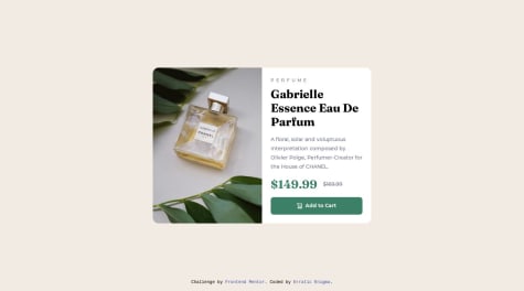
max-widthto your content, so it doesn't grow infinitely. It looks too big on wide screen.0 - @erratic-enigmaSubmitted over 1 year agoP@sergrosuPosted 10 months ago
You're pretty close. One thing I would change, is the cart icon: it's a style element and it's probably not a good idea to have it in your html. You can implement it inside your button using the
::beforepseudo-element:.button-cart::before { content: ""; width: 15px; height: 16px; background-image: url(../images/icon-cart.svg); }0 - P@tunaertenSubmitted 10 months agoWhat are you most proud of, and what would you do differently next time?
It took longer than I expected. I saw that the project had a lot of details. The Figma file was really helpful. At first, I didn't use flexbox or grid to build the project. After finishing the project and starting to set up media queries, I noticed that when the page began to shrink, it caused many small problems. Therefore, I went back to the beginning and redesigned the page with a grid. This time, I got the result I wanted. In my next project, I will definitely consider this from the start. For the first time in CSS, I used the (:not) operator. I had seen it a few times but had never used it before. Other than that, it was a very enjoyable project. I am eagerly looking forward to the next project.
What challenges did you encounter, and how did you overcome them?I used table for the first time. I frequently referred to MDN pages to recall what I had learned.
What specific areas of your project would you like help with?I definitely need help with landmarks. I read the article, but I keep making mistakes in every project when I try to implement them. I would be very grateful if someone could show me how to use landmarks in my project.
P@sergrosuPosted 10 months agoYou're very close. I would suggest adjusting the
min-heightproperty to 1vh, to get rid of the white space at the bottom of the page:body { min-height: 1vh; }You can also decrease the list markers size with:
ul::marker {
font-size: 0.75rem;
}
Marked as helpful0 - @Akansha82Submitted 10 months agoWhat are you most proud of, and what would you do differently next time?
I'm most proud of successfully completing this Frontend Mentor challenge.
What challenges did you encounter, and how did you overcome them?One of the major challenges I encountered was to properly align the images and text in card.
What specific areas of your project would you like help with?Any guidance on improving responsiveness, optimizing code structure, or enhancing accessibility would be greatly appreciated.
P@sergrosuPosted 10 months agoYou're pretty close. Just work a bit more on spacing and sizing.
Marked as helpful0 - @viral-parmarSubmitted 11 months agoP@sergrosuPosted 10 months ago
You're pretty close, but I would do the following changes:
- Add more padding on the white container
- Decrease border radius on the image/ image container
- Make the button text bold
- Add more margin between image and button
- Increase line height on the paragraph to 1.5
- Remove the junk at the end.
0 - @raviteja-01Submitted 10 months agoP@sergrosuPosted 10 months ago
I would suggest the following:
- Remove all the extra information from your HTML file
- Format the HTML file with Prettier
- Insert your component into a <main></main> tag: https://www.w3.org/WAI/ARIA/apg/patterns/landmarks/examples/main.html
0