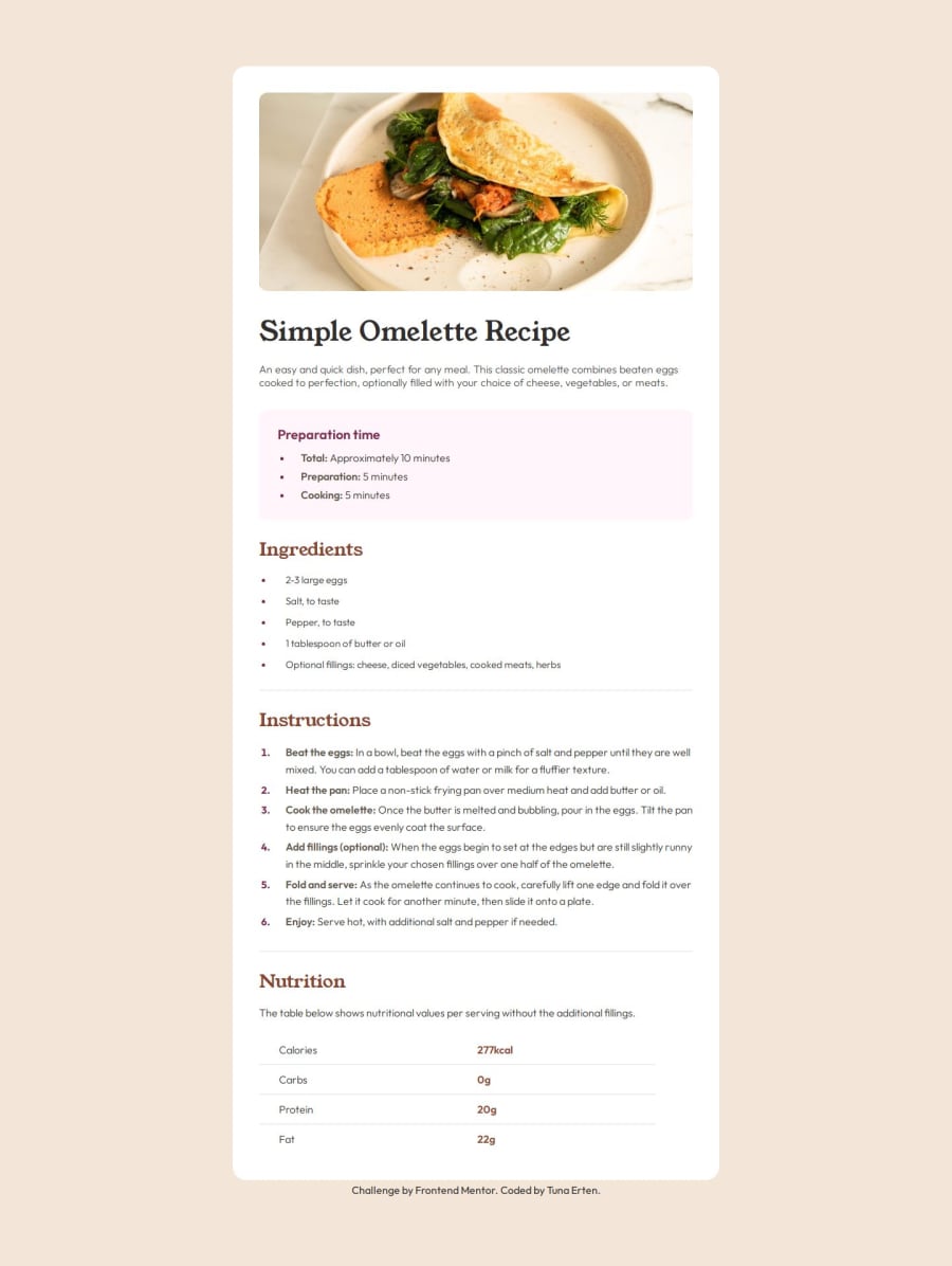


Design comparison

Solution retrospective
It took longer than I expected. I saw that the project had a lot of details. The Figma file was really helpful. At first, I didn't use flexbox or grid to build the project. After finishing the project and starting to set up media queries, I noticed that when the page began to shrink, it caused many small problems. Therefore, I went back to the beginning and redesigned the page with a grid. This time, I got the result I wanted. In my next project, I will definitely consider this from the start. For the first time in CSS, I used the (:not) operator. I had seen it a few times but had never used it before. Other than that, it was a very enjoyable project. I am eagerly looking forward to the next project.
What challenges did you encounter, and how did you overcome them?I used table for the first time. I frequently referred to MDN pages to recall what I had learned.
What specific areas of your project would you like help with?I definitely need help with landmarks. I read the article, but I keep making mistakes in every project when I try to implement them. I would be very grateful if someone could show me how to use landmarks in my project.
Community feedback
- P@sergrosuPosted 9 months ago
You're very close. I would suggest adjusting the
min-heightproperty to 1vh, to get rid of the white space at the bottom of the page:body { min-height: 1vh; }You can also decrease the list markers size with:
ul::marker {
font-size: 0.75rem;
}
Marked as helpful0 - P@tunaertenPosted 9 months ago
@sergrosu Thanks for the tip. I think I will use em and rem instead of px in my future projects. They are much easier for responsive design
0

Please log in to post a comment
Log in with GitHub
Join our Discord community
Join thousands of Frontend Mentor community members taking the challenges, sharing resources, helping each other, and chatting about all things front-end!
Join our Discord