Not Found
Not Found
Not Found
Not Found
Not Found
Not Found
Not Found
Not Found
Not Found
Not Found
Not Found
Not Found
Not Found
Not Found
Not Found
Not Found
Not Found
Not Found
Not Found
Not Found

All comments

  • Avinash Dhauniā€¢ 170

    @avinashdhauni

    Submitted

    I am still finding it hard to remove the background of the non-clicked ratings. I wanted something like if I click the single rating and after that if I click another rating then the clicked rating background should change and the other ratings background color remains the same.

    I don't know if you guys understood but please check it out and click on multiple ratings. You will see that all the clicked elements change the background. But I just want to change the single clicked elements background and remove another rating background.

    Satyam Jhaā€¢ 400

    @satyammjha

    Posted

    Great attempt Avinash. I have a solution for your query. On clicking the rating first remove the active class from all the ratings and add the active class to the targeted rating. You may use the code below:-

    e.addEventListener("click", (event) => {
    rating.classList.remove("active")
    event.target.classList.add("active")
    selectedRating = event.target.innerHTML;
       }) }); `
    
    This might help you. Happy Coding āœŒšŸ»šŸ˜Š
    
    0
  • Satyam Jhaā€¢ 400

    @satyammjha

    Posted

    Great attempt @MikeOdhiambo. I have one piece of advice for you. You may add input::-webkit-outer-spin-button, input::-webkit-inner-spin-button { -webkit-appearance: none; } for the input type number. It will hide the arrows for input. I hope it helps. Happy Coding āœŒšŸ»šŸ¤—.

    Marked as helpful

    0
  • @Zaratosh13

    Submitted

    1- I found it easy but using some of my own resorce would be better. 2- The picture intrigation part i felt confusing but pratice will make me perfect. 3- Yes best pratice will be letting other use there images and design because that will promote a creative mindset.

    Satyam Jhaā€¢ 400

    @satyammjha

    Posted

    Great attempt Abhishek. It's good that you used your own resource but sticking to the design given will help you in the future when you will work for clients. One more piece of advice I have for you is you may use transition: 0.3s ease for the button, it will delay the background color change on hovering over the button. Hope it helps. Happy CodingšŸ¤—āœŒšŸ».

    Marked as helpful

    0
  • Satyam Jhaā€¢ 400

    @satyammjha

    Posted

    Great attempt @JoeMarv. I have a few suggestions for you:-

    1. Please decrease the height and width of the parent div.
    2. Adjust the height of the `:: before for the eye. So that on hover it will cover the whole NFT image.
    3. Increase the margin-top for the profile section.
    4. Add align-item: center for the author class.

    Hope it helps. Happy CodingšŸ¤—āœŒšŸ».

    Marked as helpful

    0
  • Nancy Rivasā€¢ 10

    @ndrivas87

    Submitted

    Which areas of your code are you unsure of?

    • As much as I'm happy with the result, I know that my image should adapt to the border-radius of the main card. When trying to add a border-radius to the parent div, it would not adjust the shape of the image therefore I added a border-radius to the image itself in the media query.
    Satyam Jhaā€¢ 400

    @satyammjha

    Posted

    Great attempt @ndrivas87. I have a few suggestions for you:-

    1. For the border radius of image use Border-Radius: 25px 0px 0px 25px , It will set border radius of the left side of the image to 25px.
    2. You may use transition: 0.3s ease for the button so that the change in color of the button on the hover will be smooth.
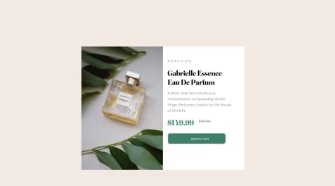
    3. Use <br> after Gabrielle and Eau it will break the line and the title would be the same as given in the design.
    4. You may use align-items: self-end; for the price class it will align the old price with the new price.
    5. Use .card-info .btn {margin-top: 45px;margin-left: 32px;} . It will bring the button to the correct position.

    And one last thing, change the font of the button as it was given in the style guide. Hope it helps. Happy CodingšŸ¤—āœŒšŸ»

    Marked as helpful

    0
  • Satyam Jhaā€¢ 400

    @satyammjha

    Posted

    Great work @korede2000. I have a tip for you to improve the button. You may add transition time for the button by using transition: 0.3s ease so that it will take some time to change the color of the button on hover. All other things are best according to me. Happy CodingšŸ¤—āœŒšŸ»

    1
  • Satyam Jhaā€¢ 400

    @satyammjha

    Posted

    Hey @septober92, this is just perfect.

    1
  • Akash Singhā€¢ 60

    @akash-singh95

    Submitted

    Hi everyone. I am having trouble dealing with images, it's like I have no control over their dimension and thus they take container space according to their wish. 1)How do I make my QR code take 70% of screen height in mobile view without explicitly stating it? 2)Why are my flex: grow shrink and basis property not reflecting as I wish it to? 3)Any other feedbacks regarding improvement are most welcome.

    Satyam Jhaā€¢ 400

    @satyammjha

    Posted

    Great Design Akash. I have a few suggestions for you:-

    1. Please increase the height of the container div.
    2. Use the <br>tag after the word front-end of the h4.
    3. Use the <br> tag after the word front-end and to of the paragraph so the text will appear as it is given in the design.
    4. Increase the font size of <h4>. All other things are perfect. Hope it will help you.

    Marked as helpful

    0
  • Satyam Jhaā€¢ 400

    @satyammjha

    Posted

    Great Solution @Joseph-Benavides. I have a few suggestions for you to further improve your design:-

    1. Use <br> tag after the word Eau so that the next word will move to the below line and the heading will appear as it is given in the design.
    2. Please recheck the spelling of PERFUME instead of PPPERFUME.

    The rest of the things are perfectly coded.

    0
  • HASAN KAMELā€¢ 10

    @HasanWael

    Submitted

    It was easy but I just found one difficulty when I was centering the white card or the <div> that carries the qr, But I found the solution by searching in google.

    I am not sure about the centering of the white card or the <div> that carries the qr.

    Satyam Jhaā€¢ 400

    @satyammjha

    Posted

    Great solution @HasanWael You can center the QR by using align-item: center to the CSS of the div containing the QR. Hope it will help you.

    Marked as helpful

    1
  • Satyam Jhaā€¢ 400

    @satyammjha

    Posted

    Great solution @iammiracle01, I have a few suggestions to further improve the solution:

    1. Add a hover effect on the button.
    2. Change the size of the h1 and add <br> after 'Gabrielle Essence '. for the phone view of the website.
    3. Increase the width of the container and decrease the height for the phone view after doing the 2nd point.

    Hope these will help you in further improving your solution. Happy Coding šŸ¤—āœŒšŸ»

    Marked as helpful

    0
  • Satyam Jhaā€¢ 400

    @satyammjha

    Posted

    Great attempt @Arearda. I have some suggestions for you:-

    1. use the <br> tag after the word front-end so that other skills will move to the next line.
    2. use the <br> tag after the word frontend and to in the paragraph.
    3. Use color: rgb(135, 135, 135); for the paragraph.
    4. Your design is not responsive. Use media queries to make it responsive according to the screen resolutions.
    5. For fonts and colors used in the projects please read the style guide of the project before coding.

    Hope these tips will help you. Happy Coding šŸ¤—āœŒšŸ»

    0