
Ron Paolo Toyhacao
@rontoyhacaoAll solutions
- Submitted over 2 years ago
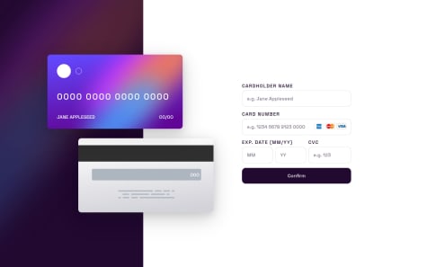
Mobile-first Interactive card details form
#accessibility#animation#bem#sass/scss- HTML
- CSS
- JS
- Submitted over 2 years ago
Mobile-first Intro section with dropdown navigation
#bem#sass/scss- HTML
- CSS
- JS
- Submitted over 2 years ago
Desktop-first Tip Calculator using CSS Grid and Flexbox
#sass/scss- HTML
- CSS
- JS
- Submitted over 3 years ago
Mobile-first Manage Landing Page using CSS Grid, Flexbox, and SwiperJS
- HTML
- CSS
- JS
- Submitted almost 4 years ago
Mobile-First Blogr Landing Page using Flexbox and Grid with GSAP
- HTML
- CSS
- JS
- Submitted almost 4 years ago
Huddle Landing Page With A Single Introductory Section using Flexbox
- HTML
- CSS