@alvaroormenoSubmitted about 2 years ago
Please let me know if you have any feedback on how to improve my design or write better code! :)

Please let me know if you have any feedback on how to improve my design or write better code! :)
Hello Alvaro,
You have done great job coding this challenge! Though it can be improved a little.
1.You reset rules for margins, paddings, and box-sizing do not work, because there is syntax error just before that ruleset. Here is that part of your code:
--Very-light-gray: hsl(0, 0%, 95%);
};
The reason for that is semicolon before that ruleset right after preceding curly braces. Just put your css file in any CSS checker and you will see it.
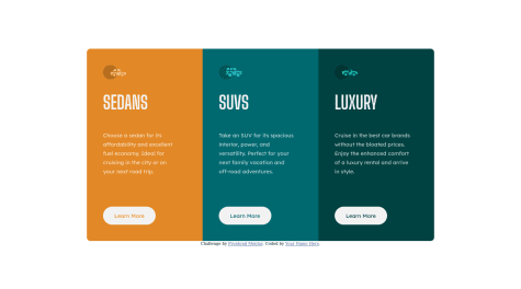
2.Your design is not responsive on the way from desktop to mobile version and at some point horizontal scroll bars appear. The reason for that is the use of fixed size width: 230px command for the .column-X. You would recommend to use max-width: 920 for .main-container. That command will allow you container to shrink as the size of viewport decrease.
3.There is no need to make rounded corners of first and last column. You can achieve the same effect by applying following commands to .main-container. border-radius: 10px; overflow: hidden;
4.You repeat the same commands for all three .column-X. Better way to do this is too put all repeating commands in separate common ruleset by creating common class for all three columns. Something like this:
in HTML:
<div class="column column-3"> <div>in CSS: .column { }
Hope it will help! Have a nice day!
hey everyone, hope you're doing good. this is my first time working with grid and I'm happy how it turned out though I had a lot of issues still glad I did it. I had a problem scaling my text to move with my box for the mobile view but read an article about adding a width of 100% to the parent/ child container. i actually always face the problem where my text doesn't move with my container box like it doesn't shrink or increase while scaling I was hoping if anyone has any tips on how to fix it please comment and help me out. thanks alot
Hello Oduh,
You have done great job coding this challenge! I like your use of area templates for Grid layout. Regarding for your question. You use fixed sizes for elements and Grid and that do not allows your elements to shrink. Here are some changes that can improve your responsiveness.
Do not forget to change them in media queries too.
Hope it will help! Have a nice day!
Feedback is welcome. Do like the responsivness?
I tried to align the button, which is the last element in my container with justify-self:flex end; but it didnt work (the container itself has display:flex;). Does somebody know why this didn't work?
Hello Martin,
Great Job! As for justify-self: flex-end. Flexbox do not support this command. When you applied flex-direction: column to the flex container, you turned Main axis of flex container downwards and the only align command that Flex supports along the Main axis is justify-content.
I have tested how to fix your issue with button alignment. One of the options I have found is to apply flex-grow: 1 to the paragraph element inside your flex container. That way paragraph element will take all the free space that appear when text wraps and push button element to the bottom.
Hope it will help. Have a nice day!
How can I get the background image to grow alongside the window size? When the height gets too long, it just cuts off since I made it not repeat. Other than that, any other tips or criticisms? Thanks.
Hello Ahmet,
You have done great job! It was tricky challenge for me too. Regarding background cut off. The problem is not with background properties. That part of your stylesheet looks great. The problem is with body element. Background images are positioned along its sides and it is not high enough to cover all screen in desktop layout. You can see it in any dev tools. You can use: body { min-height: 100vh; } to set body element height to at least full viewport height.
Hope it will help you to fix your issue! Happy coding!
Kindly leave some suggestion. what area can be improved.
Hello Abdul,
You have done great job coding that challenge. This challenge has tricky background. As the background images are narrower than desktop width they starts to repeat itself. You can set position and repetition of background using
background-position: left top, right bottom;
background-repeat: no-repeat;
Hope it will help! Happy coding!
Hello Vihaan Sharma,
You have done great job! Just one note: it is much easier to resize elements if you set box-sizing: border-box for all elements from the start.
Happy coding!
Hello Robert!
Great Job! I am newbie too, but here is what I see:
Too many divs. It is hard to check style sheet. It is the tag of last resort. Use it only if you really need it. Put h1 and p on one line if it is possible.
Max size for card is 350px. It would be easier to follow solution mockup if you set max-width: 350px for .outerCard.
Use img tag for svg files.
Hope it will help. Happy coding!