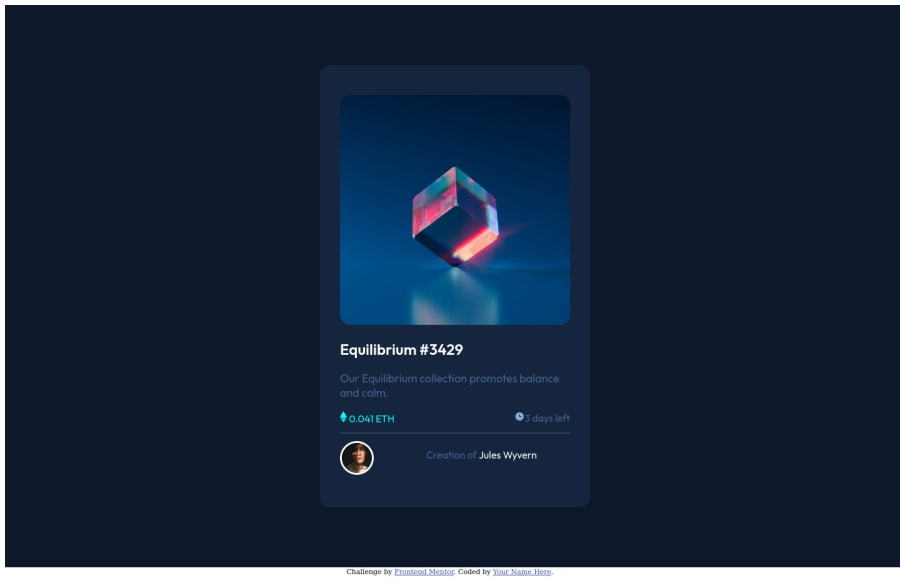
Design comparison
Community feedback
- @AdarshRai0Posted over 2 years ago
Hi Robert M Schwindler, congratulations on your new challenge!✨🎯
I took a look at your code and I have some tips for you.🙌
If you want to improve your solution a bit I've two advice for your:
Consider adding a lang attribute to the html start tag to declare the language of this document.
<html lang="en">Semantic tags
The direct children of the body must be wrapped in semantic tags to indicate users about the various purposes of different parts of a webpage.
For example,
  <header>
    ...header of the webpage...
  </header>

  <main>
    ...main content of the webpage...
  </main>

  <footer>
    ...footer of the webpage...
  </footer>
</body>
Bad value images\image-equilibrium.jpg for attribute src on element img: Backslash () used as path segment delimiter.
Context:
<img src=`images\image-equilibrium.jpg` alt=`Equilibrium Image` class=`image`>To
<img src=`images/image-equilibrium.jpg` alt=`Equilibrium Image` class=`image`>Congratulations, since your first project, your challenges have gotten better and better.
1 - @rishat-sePosted over 2 years ago
Hello Robert!
Great Job! I am newbie too, but here is what I see:-
Too many divs. It is hard to check style sheet. It is the tag of last resort. Use it only if you really need it. Put h1 and p on one line if it is possible.
-
Max size for card is 350px. It would be easier to follow solution mockup if you set max-width: 350px for .outerCard.
-
Use img tag for svg files.
Hope it will help. Happy coding!
0 -
Please log in to post a comment
Log in with GitHubJoin our Discord community
Join thousands of Frontend Mentor community members taking the challenges, sharing resources, helping each other, and chatting about all things front-end!
Join our Discord
