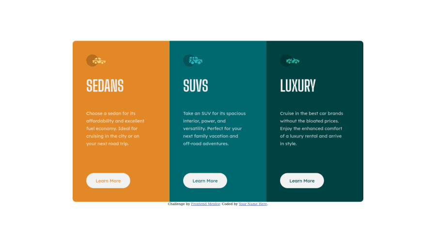
3 Columns Preview Card Component - HTML & CSS


Design comparison

Solution retrospective
Please let me know if you have any feedback on how to improve my design or write better code! :)
Community feedback
- @DavidMorgadePosted over 2 years ago
Hello Alvaro, congrats on finishing the challenge! you did a great job!
There is just a little problem, you are using a
@media(max-width: 380px), this means that the styles described in that media quierie will only be available from 0 to 380px, if you want it to cover all mobile sizes you should go for@media(max-width: 768px). It will fix the issue from 380px to 768~px, then it will show up your desktop styles.Apart from that little fix, I would recommend you to use some
sectiontags for content related like the columns, instead of usingdivs.Hope my feedback helps you!, if you have any question, don't hesitate to ask
Marked as helpful1 - @rishat-sePosted over 2 years ago
Hello Alvaro,
You have done great job coding this challenge! Though it can be improved a little.
1.You reset rules for margins, paddings, and box-sizing do not work, because there is syntax error just before that ruleset. Here is that part of your code:
--Very-light-gray: hsl(0, 0%, 95%);
};
- { margin: 0; padding: 0; box-sizing: border-box; }
The reason for that is semicolon before that ruleset right after preceding curly braces. Just put your css file in any CSS checker and you will see it.
2.Your design is not responsive on the way from desktop to mobile version and at some point horizontal scroll bars appear. The reason for that is the use of fixed size width: 230px command for the .column-X. You would recommend to use max-width: 920 for .main-container. That command will allow you container to shrink as the size of viewport decrease.
3.There is no need to make rounded corners of first and last column. You can achieve the same effect by applying following commands to .main-container. border-radius: 10px; overflow: hidden;
4.You repeat the same commands for all three .column-X. Better way to do this is too put all repeating commands in separate common ruleset by creating common class for all three columns. Something like this:
in HTML:
<div class="column column-3"> <div>in CSS: .column { }
Hope it will help! Have a nice day!
Marked as helpful0


Please log in to post a comment
Log in with GitHub
Join our Discord community
Join thousands of Frontend Mentor community members taking the challenges, sharing resources, helping each other, and chatting about all things front-end!
Join our Discord