Not Found
Not Found
Not Found
Your session has expired please log in again.
Not Found
Not Found
Not Found
Not Found
Not Found
Not Found
Not Found
Not Found
Not Found
Not Found
Not Found
Not Found
Not Found
Not Found
Not Found

All solutions

  • Submitted


    What are you most proud of, and what would you do differently next time?

    Practicing more on layouts especially on the main section by using the flexbox to place the desktop image on the left most part to display a cropped version of the image.

    This is how I do the coding to achieve it

      @media screen and (min-width: 1200px) {
      .featWrap {
        display: flex;
        gap: 1rem;
      }
    
      .FeatImg {
        margin-left: -3rem;
      }
    }
    

    What specific areas of your project would you like help with?

    I acknowledge the goal of the challenge is to optimize layouts for various screens, and I tried to do accessibility practices as well such as

    • Adding skip links
    • Adding scale changes on hover and active states for links
    • Contrast between foreground and background colors
    • Using ARIA for images and button links

    If there is anything you can add, please feel free to let me know to improve my awareness of accessibility.

  • Submitted


    What are you most proud of, and what would you do differently next time?

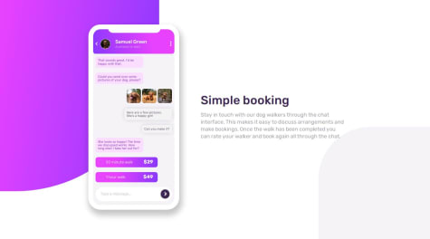
    The use of pseudo-code ::before and ::after helped me to add content like accent designs and radio button for the choices in the message container.

    The snippet below will show how I did the styling for the mockup radio button

    .time:before {
      content: '';
      display: inline-block;
      height: 1rem;
      width: 1rem;
      border: 0.1rem solid var(--radio-btn);
      border-radius: 50%;
      margin-right: 0.5rem;
    }
    

    What challenges did you encounter, and how did you overcome them?

    I was hesitant to do the phone app but I discovered to make a container that will have respective divs for every element and class to style each individual properly.

  • Submitted


    What are you most proud of, and what would you do differently next time?

    The ease of using Flexbox for every section is my favorite part of coding. Using the flex-direction property helped me to designate every element in the flexbox. Using the background-position property also helped me to give the right position for the curve divider in the testimonial section.

    What challenges did you encounter, and how did you overcome them?

    The testimonial card was the tricky part for me at first but I found that it should be inside a container to be able to make it a card.

  • Submitted


    What are you most proud of, and what would you do differently next time?

    I learned how to do the progress bar by using div, and span to put the fill in the bar

    To see how you can add code snippets, see below:

    HTML

    CSS

    To be able to do the circle indicator inside the progress bar, I used the pseudo-code ::after.

    I included the code snippet of the value for the span::after.

        /* Add the indicator to progress bar fill */
        .progress_bar span::after{
            content:'';
            background-color:var(--PaleBlue);
            height:inherit;
            width:1rem;
            right: 20%;
            position:absolute;
            border-radius: 50%;
          }
    

    What challenges did you encounter, and how did you overcome them?

    Adding the tip to the quota box is a bit challenging for me so I did use for now a CSS Clip Path Generator.

  • Submitted


    What are you most proud of, and what would you do differently next time?

    Using the z-index to overlap the CTA over the footer section

    What challenges did you encounter, and how did you overcome them?

    At the beginning of the website styling, I tested setting the height to the hero banner and it became a problem when doing the responsive website since my image and the first card overlapped. So I decided to remove the height value and the problem has been resolved

  • Submitted


    I've been doing the grid template areas property since this is the easiest technique for me at the moment. Just learned also how to put a background image on a cell and do the background position for it. Any feedback and suggestions are highly appreciated.

  • Submitted


    I tried to apply here what I learned from the feedbacks I got from my last two attempts on blog page and qr code challenges.

    I am still learning on using less pixel unit and implementing percentage, vh, vw, rem, and em as measurement. Also, still learning for proper flex and grid alignments. All feedbacks and suggestions are highly appreciated. :)

  • Submitted


    Any feedback or suggestions regarding with my coding is highly appreciated. Thank you! :)

  • Submitted


    I recently finished my web development I course from my college so I tried the first time to use frontend mentor to keep me on track and practice what I've learned. I learned to use comment everytime on my code so that I keep track on which parts I've made and the use of modular scaling for texts instead of pixels.

    I used also a CSS reset for this one since it made me comfortable to style freely and being more precise somehow with my spacing.