@jeissongomezdevSubmitted over 2 years ago
All feedback will be well received. Thanks!

All feedback will be well received. Thanks!
The animation to your solution is really cool.
My desktop viewport width is 1600 and at that width the middle button on the page is lower than the two buttons on the side. The solution looks good when I display it at 1440 though.
I really like your usage of semantic HTML to order the elements on the page.
Keep up the good work!
Hello!
It's really impressive that you made this using React. It displays great on mobile and desktop.
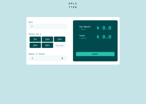
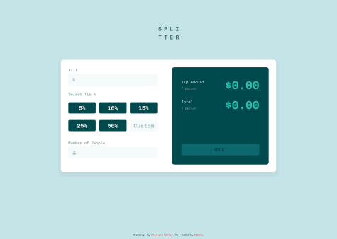
One suggestion would be to change the type of each input to be type="number" so that no letters can be typed in. I would also add a maxlength to each input to limit how many numbers people can type in.
Keep up the good work!
I wanted to work on state management and conditional rendering. As always I made this with the idea that it could be scaled with relative ease. I do welcome any feedback on how I could further improve upon this project.
Hey,
I really like your use of semantic HTML in the solution. The CSS styling looks great too.
I really liked how you used a specific order for your CSS properties. Your code looks very organized.
Adding an event listener to the input elements to validate the input would be a good improvement. You can use regex to check that the input is only numbers or decimals:
e.g. if (/^\d*.?\d*$/.test(this.value)) { do something; }
You can also use html to specify the input to be type="number" to only allow number inputs instead of using javascript.
Keep up the good work!
Esse deu um trabalhinho de fazer, mas foi muuuito massa concluir. Fiz o react pra poder abrir espaço pra componentização e me economizar um esforço, e também usei styled components. Acho que ficou bem bom. 100% responsivo
It looks good! Nice work.
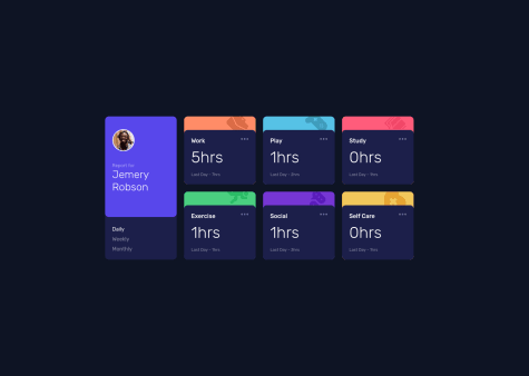
A critique I would make is that the background is peeking through on the corners of the desktop grid cards. Maybe the dark blue inside cards need to be slightly larger to cover up the gap.
You can declare variables in your CSS stylesheet like :root {--blue: hsl(246, 80%, 60%);} and then reference them in your CSS like .body {background-color: var(--blue);} so that you don't need to copy and paste hex values or rgb values which can be confusing.
Keep up the good work!