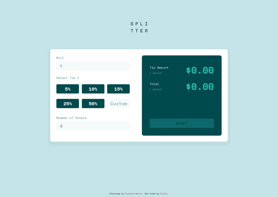
Design comparison
Solution retrospective
I wanted to work on state management and conditional rendering. As always I made this with the idea that it could be scaled with relative ease. I do welcome any feedback on how I could further improve upon this project.
Community feedback
- @besttlookkPosted almost 3 years ago
HI, Following are some points i like to add:
- Use input of type "number". User should not be able to enter any other character.
- Use flex-box to center the whole content w.r.t screen
- Check your design for large input and large output. Currently on entering large input digit overlap the input-icon. Also on getting large output, result comes out of the card.
- Give max limit to input and custom percent to avoid getting very large output.
Good luck,
Happy coding
Marked as helpful1 - @pmork7Posted almost 3 years ago
Hey,
I really like your use of semantic HTML in the solution. The CSS styling looks great too.
I really liked how you used a specific order for your CSS properties. Your code looks very organized.
Adding an event listener to the input elements to validate the input would be a good improvement. You can use regex to check that the input is only numbers or decimals:
e.g. if (/^\d*.?\d*$/.test(this.value)) { do something; }
You can also use html to specify the input to be type="number" to only allow number inputs instead of using javascript.
Keep up the good work!
Marked as helpful0
Please log in to post a comment
Log in with GitHubJoin our Discord community
Join thousands of Frontend Mentor community members taking the challenges, sharing resources, helping each other, and chatting about all things front-end!
Join our Discord
