petemac281
@petemac281All comments
- @AmneisaOB@petemac281
Nice work! Aside for a few styling differences, it's perfect
- @Oswalld@petemac281
Great work. Getting the desktop layout wasn't easy and you've done that pretty well
- @Oswalld@petemac281
Great job. Nicely done
- @Pablo-Zallio-DevWhat are you most proud of, and what would you do differently next time?
The most important thing about this project is that even though it took me a long time I was able to finish it.
What challenges did you encounter, and how did you overcome them?I had a hard time with the logic in the JavaScript part.
@petemac281You did a great job with this. It works, it looks good. What more can you ask for?
- @TomSifWhat are you most proud of, and what would you do differently next time?
I started with the design of the mobile version, then the success message and then I adjusted the media queries for the desktop version, once the whole structure was perfectly finished, I started on the javascript part. At first I was really overwhelmed, I didn't know where to start but by listing my needs and how to proceed I was able to find a solution that wasn't too complex. I probably should have done things differently on how to hide the main container, I modified the display directly in the css with javascript, I probably should have added a .hidden class but I didn't have the courage to start again.
What challenges did you encounter, and how did you overcome them?Figuring out how to change the border radius directly in the svg file so that it fits the design, I searched a bit. This is by far the most complex project I've done so far and yet it's really a small project on a single page, with little interaction, I realize how far I still have to go. travel and it feels like climbing Everest sometimes, but small steps by small steps, I progress at my own pace.
What specific areas of your project would you like help with?All advice is welcome, especially on how I structured the project, I am curious to see if there was simpler or how others have proceeded, I would perhaps look at other projects to learn an idea. The JavaScript approach is still a big gap, even if I understand the language, sometimes I have a lot of trouble articulating the functions together.
@petemac281You did great. I'm just starting out, but I look at some of what you did and it gives me thoughts about how I can make my own projects better.
- @hasnatlubaid@petemac281
Great Job. Really tidy code!
- @mudasirNadeemWhat are you most proud of, and what would you do differently next time?
I'm proud of successfully implementing the grid layout, as it made the design more structured and flexible. Next time, I’d focus on refining responsiveness for larger screens and improving accessibility features.
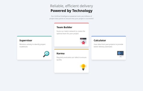
What challenges did you encounter, and how did you overcome them?I initially struggled with aligning grid items and ensuring the layout was responsive across different devices. I overcame this by tweaking grid-template properties and using media queries to fine-tune the design for various screen sizes.
What specific areas of your project would you like help with?I’d like feedback on improving the grid layout’s responsiveness, especially for larger screens. Additionally, I’m looking for suggestions on enhancing accessibility, such as better keyboard navigation and optimized ARIA labels.
@petemac281Good job. I think you were slightly hampered by having so much text. The example has a lot less text and therefore it's difficult for you to match it. Consider an additional container which is smaller than the page to help you manage the tiles, especially on larger screens.
Marked as helpful - @nowshadjaman21@petemac281
Nice work. A little off with the colours, but I'm guessing you were going for that. Nice shorthand styling too. Makes it much cleaner than mine.
- @fortunat81What challenges did you encounter, and how did you overcome them?
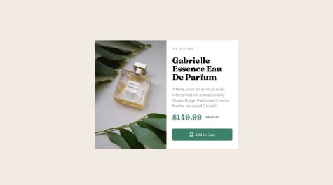
changing the img src with media query without having to load both and use (display:none) and without javascript .
I used the picture tag with source tag to solve the problem.
@petemac281Great job! Perfect!
- @8NeoN8@petemac281
Perfect. What else can be said?
- @AndiCoding@petemac281
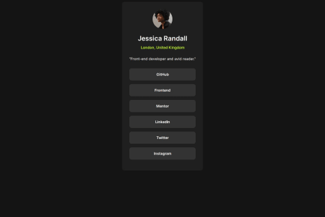
Looks good. Just need to centre in the horizontal plane and you're 100%
- @DoggiLoL@petemac281
Nice work. Tiny bit off on the margin of the h1 but, if anything, yours looks better
Marked as helpful - @amontesino@petemac281
Nice shadow on the container.


