Not Found
Not Found
Not Found
Not Found
Not Found
Not Found
Not Found
Not Found
Not Found
Not Found
Not Found
Not Found
Not Found
Not Found
Not Found
Not Found
Not Found
Not Found
Not Found
Not Found

All comments

  • P
    KurtJFโ€ข 150

    @KurtJF

    Submitted

    There are a couple of problems I encountered. . .

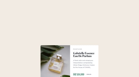
    • The hero image is not shrinking even with max-width and % used?

    • Is there a way to position the icons inside the circle better?

    • How can I make both the icon and the circle border change color on hover at the same time?

    Any advice regarding CSS if there are declarations I can remove would be greatly appreciated, Thanks!

    Osaro Iyohaโ€ข 1,080

    @osaaroh

    Posted

    Hello Kurt,

    Nice work on the challenge. The mobile view looks good but you can add margin-top for the".socmed-container". For your questions:

    • Since the "main" tag is a flex item, wrap the hero "img" in a div tag, and give the child elements of the main tag a flex of 1 like so
        <main class="hero-container">
          <div class="img-container">
             <img src="">
         </div>
          <section class="content-container">
          </section>
        </main>
    
        .img-container{
            flex: 1
        }
        .content-container{
            flex: 1
        }
        img{
            /*Use width instead of max-width here*/
            width: 100%
        }
      
    
    • I suggest you take out the border from the "li" element an use it on the "fa-brands" class like this:
    
    .fa-brands {
      color: var(--white);
      font-size: 1.1rem;
      border: 1px solid white;
      padding: 1rem;
      border-radius: 3rem;
    }
    .fa-brands:hover {
      color: var(--soft-magenta);
      border: 1px solid var(--soft-magenta);
    }
    
    • You can take out the "top" and "right" property in the "fa-brand" class

    Hope this helps

    Marked as helpful

    1
  • Madu Jangโ€ข 340

    @MJspitta

    Submitted

    If the mobile view and desktop view are the same, is there a need to do a media query for the page still?

    Osaro Iyohaโ€ข 1,080

    @osaaroh

    Posted

    Hello Madu, congrats on finishing the challenge.

    For your question, if the mobile view and desktop view are the same and is already responsive enough as in this case, then no, there is no need for a media query.

    Marked as helpful

    0
  • @Bolumorin

    Submitted

    The one thing I found difficult while working on this is Responsiveness. How can I make this how responsive as possible? Would CSS flexbox had given me a more responsive outcome? Please I'd really appreciate your feedbacks and what you think I'd have done best!

    Osaro Iyohaโ€ข 1,080

    @osaaroh

    Posted

    Hello Bolu,

    Good work in completing the challenge. Yes CSS flexbox will help with a more responsive outcome instead of using margins to center element.

    • To center your card, I recommend you remove all the margins (top and left) you put on your "container" div. Instead add the following attributes to your "body" element:
      display: flex;
      justify-content: center;
      align-items: center;
      min-height: 100vh;
    

    The first three is to center all child elements horizontally and the last one takes all the size of the height of the device that sees it and centers the content vertically.

    • You can use "text-align:center" on your ".top" element to center all text

    Hope this helps.

    Marked as helpful

    1
  • Osaro Iyohaโ€ข 1,080

    @osaaroh

    Posted

    Hey Lucas,

    Good work here. If you check your browser console tools when you load the github page, you will notice there's a 404() Not Found error: the quotation image cannot be found.

    You need to check that the file path is defined properly in your css file like so:

    .testimonial-one {
      background-image: url(images/bg-pattern-quotation.svg);
    }


    Regards.

    Marked as helpful

    1
  • 52ymonโ€ข 30

    @52ymon

    Submitted

    It looks like I can't center the card as it should be, and I can't get my head around it... It would be greatly appreciated if anyone could give me some pointers :)

    Edit: Thanks guys! I'm booking my eye test :')

    Osaro Iyohaโ€ข 1,080

    @osaaroh

    Posted

    Hey there Szymon,

    Nice work so far. I see you used relative length units "vw" which is great as they scale better. However the issue is with the height value your the <body> tag.

    Instead of height: 100vw you should use height: 100vh

    vw means relative to the width of the viewport and is different from vh means relative of the height of the viewport.

    You can check these links for more info:

    Marked as helpful

    0
  • Emmanuel Onuorahโ€ข 60

    @Emmanuel-webDev

    Submitted

    I had problem displaying the two p tags opposite to each other

    Osaro Iyohaโ€ข 1,080

    @osaaroh

    Posted

    Hello Emmanuel,

    Good work so far on the challenge.

    You can use CSS flexbox/grid to display the two paragraphs side by side. For example, If you put the two paragraphs in a flex container div with class="stats__container"

    .stats__container {
        display: flex;
        flex-direction: row;
        justify-content: space-between;
        align-items: center;
    }


    This will give better result than text align. Check out these resources to learn more on Flexbox and Grid:

    Marked as helpful

    0
  • Osaro Iyohaโ€ข 1,080

    @osaaroh

    Posted

    Hello Josh,

    Welcome and good work in completing the challenge. Here are some suggestions:

    • If you want to center your card I recommend you to remove all the margin on "section", put <section> inside a <main class="card-main"> tag with the following attributes:
      display: flex;
      justify-content: center;
      align-items: center;
      min-height: 100vh;
    

    The first three is to center in the middle and the last one takes all the size of the height of the device that sees it and if the content is bigger the box is enlarged for that reason it is minimum of height.

    • You can use the "View Report" section for recommendations and implement them to make your code better

    Marked as helpful

    0
  • Ernest Push Gbabohโ€ข 460

    @gbabohernest

    Submitted

    I struggled on adding hover effect to the social links in the footer. At first, I thought it was an icon, and I decided to add hover effect to it and change the color on hover. However, it didnt work cause it is an image. I also added it to the parent element but i didnt like the outcome.

    Any help on how to handle this would be helpful and also any feedback on my solution and how to improve it will be great . Thanks and happy coding ๐Ÿ‘๐Ÿ‘

    Osaro Iyohaโ€ข 1,080

    @osaaroh

    Posted

    Hello Ernest,

    Nice work so far! As you discovered, you will not be able to use the color or background-color css properties to modify the color on an <img> tag. However, if you use an img tag and want to change the color property from black to any other color, one workaround is to use css filter:

    
    a:hover {
            filter: invert(55%) sepia(87%) saturate(357%) hue-rotate(121deg) brightness(93%) contrast(92%);
        }
    

    You use the CSS Filter Generator(Codepen) from here and enter the color code you want to change to. It will generate a filter for you and you can use it on the image. Note that this works best when the image color is black/very dark.

    • Alternative1: You can use icon fonts like Bootstrap Icons to use the "color" property to change the color like text.
    • Alternative2: Using Inline SVG instead and "fill" property to change color

    Hope this helps.

    Marked as helpful

    0
  • shemjayโ€ข 140

    @shemjay

    Submitted

    What I found really difficult while building the projects was:

    1. How to properly name my css classes.
    2. How to change the background color of the image using css. I still managed to do it but i could not get the color to match exactly.
    3. Positioning with css especially positioning text within flex childs I was really wingin most of the text positioning.

    Areas I am unsure of: Pretty much all areas from the parts I found difficult above lol. Though I am also unsure on how I removed the default margin and padding of my website. Instead of using the '*' (asterisk) and setting the margin and padding to 0, i used bofy, html and set that margin and padding to 0. I hope that is not bad practice.

    Questions I have:

    1. How can I get better at naming my css classes according to industry standard?
    2. What is the best way to change the background color of an image using css?
    3. What can i improve on in my attempt?
    Osaro Iyohaโ€ข 1,080

    @osaaroh

    Posted

    Hey

    Good work so far on this task. For your questions:

    • Check out the this Block, Element, Modifier methodology (BEM) article from CSS Trick here. CSS TricksBEM The BEM naming is very popular and its goal is to help developers better understand the relationship between the HTML and CSS in a given project.
    • To be frank I also use an overlay with absolute positioning like you did on this project. Maybe CSS filter will have that ability in future updates.
    • Use media queries and flex-direction to make your code responsive on mobile devices, as it currently looks packed on my mobile device
    
    @media only screen and (max-width: 576px) {
        body {
            flex-direction: column;
            text-align: center;
            background-image: url("../../images/bg-intro-mobile.png");
        }
        p {
            font-size: 0.95rem;
        }
    }
    

    Marked as helpful

    2
  • Osaro Iyohaโ€ข 1,080

    @osaaroh

    Posted

    Hi there Amine, work looks good and is very responsive.

    The only issue is your social media icons at the bottom are not displayed.

    Try checking your font awesome import or use the web cdn instead. You can check your web console for any info on the error.

    You can also check out other icon suggestions. Here are the icon library suggestions from the style guide:

    Marked as helpful

    0