Hi I'm Osaro. A system admin learning the ways of the frontend ninja🥷🏾. With the help of people in this community, I hope to become a professional web developer, assisting others as I do so. Interests: Front-end Dev 💻 | SysAdmin 👨🏾💻 | Games🎮 | UI/UX
I’m currently learning...SCSS, React.js
Latest solutions
Latest comments
- @KurtJF@osaaroh
Hello Kurt,
Nice work on the challenge. The mobile view looks good but you can add margin-top for the".socmed-container". For your questions:
Question 1
- Since the "main" tag is a flex item, wrap the hero "img" in a div tag, and give the child elements of the main tag a flex of 1 like so
<main class="hero-container"> <div class="img-container"> <img src=""> </div> <section class="content-container"> </section> </main>.img-container{ flex: 1 } .content-container{ flex: 1 } img{ /*Use width instead of max-width here*/ width: 100% }Question 2 & 3
- I suggest you take out the border from the "li" element an use it on the "fa-brands" class like this:
.fa-brands { color: var(--white); font-size: 1.1rem; border: 1px solid white; padding: 1rem; border-radius: 3rem; } .fa-brands:hover { color: var(--soft-magenta); border: 1px solid var(--soft-magenta); }- You can take out the "top" and "right" property in the "fa-brand" class
Hope this helps
Marked as helpful - @MJspitta@osaaroh
Hello Madu, congrats on finishing the challenge.
For your question, if the mobile view and desktop view are the same and is already responsive enough as in this case, then no, there is no need for a media query.
Marked as helpful - @Bolumorin@osaaroh
Hello Bolu,
Good work in completing the challenge. Yes CSS flexbox will help with a more responsive outcome instead of using margins to center element.
- To center your card, I recommend you remove all the margins (top and left) you put on your "container" div. Instead add the following attributes to your "body" element:
  display: flex;
  justify-content: center;
  align-items: center;
  min-height: 100vh;
The first three is to center all child elements horizontally and the last one takes all the size of the height of the device that sees it and centers the content vertically.
- You can use "text-align:center" on your ".top" element to center all text
Hope this helps.
Marked as helpful - P@wanluk@osaaroh
Hey Lucas,
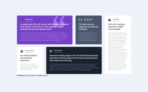
Good work here. If you check your browser console tools when you load the github page, you will notice there's a 404() Not Found error: the quotation image cannot be found.
You need to check that the file path is defined properly in your css file like so:
.testimonial-one {
  background-image: url(images/bg-pattern-quotation.svg);
}
Regards.
Marked as helpful - @52ymon@osaaroh
Hey there Szymon,
Nice work so far. I see you used relative length units "vw" which is great as they scale better. However the issue is with the height value your the
<body>tag.Instead of
height: 100vwyou should useheight: 100vhvwmeans relative to the width of the viewport and is different fromvhmeans relative of the height of the viewport.You can check these links for more info:
Marked as helpful - @Emmanuel-webDev@osaaroh
Hello Emmanuel,
Good work so far on the challenge.
You can use CSS flexbox/grid to display the two paragraphs side by side. For example, If you put the two paragraphs in a flex container div with class="stats__container"
.stats__container {
    display: flex;
    flex-direction: row;
    justify-content: space-between;
    align-items: center;
}
This will give better result than text align. Check out these resources to learn more on Flexbox and Grid:
Marked as helpful


