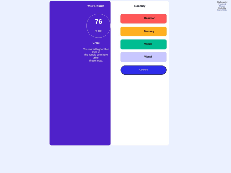
Not Found
Not Found
Not Found
Not Found
Not Found
Not Found
Not Found
Not Found
Not Found
Not Found
Not Found
Not Found
Not Found
Not Found
Not Found
Not Found
Not Found
Not Found
Not Found
Not Found

All comments

  • @FrontEndHighRoller

    Submitted

    It wasn't difficult but it took some time to build it.

    What I found challenging:

    1. Working with SVG/icons

    • I am still practising the hover effect on SVG/icons it seems every time different.

    2. HUDDLE logo in footer section -When I tried to make it smaller it simply hid part of the image

    3. text "messages sent"

    • in the mobile version, they require each word in a separate line, If I do <br> I am not sure how would I make any difference in a media query. Maybe have one div with two paragraphs and on mobile do flex-direction: column, on desktop flex-direction: row;

    4. aria label for social icons

    • <a href="https://www.facebook.com" target="_blank" aria-label="Facebook"> <i class="fab fa-facebook-square fa-2x" style="color: #ffffff"></i></a>
    Coding Nerd• 370

    @onyedikachi23

    Posted

    For the hover effects (change colour on hover) on the SVGs, you can check out this question thread from StackOverflow on how to use the CSS filter property to change the colour of an SVG image.

    From the thread: Alternatively you can use this tool from this codepen project, that works by inputting the hex coded colour to generate the filter functions and values to get the required colour.

    0
  • Leonardo• 30

    @LeonCelestino

    Submitted

    Hello! I've been awayy from frontend coding for a while because of the college, and thus I forgot somethings and I am studying from the basics again and going through frontendmentor roadmap to help me build the foundations. I've done the QR Code Component challenge today, and I am looking forward to any critiques and tips to improve my skills.

    A thing I found hard to do was to match the "bottom" of the card with the design and also to match the text breaklines on the screen sizes mentioned on "style-guide", I was able to think just about using padding-bottom and max-width with ch unit.

    Also, I am very insecure about the responsive part, I always struggle on this. Specifically speaking, I don't know if it is properly responsive or accessive, and also if the box or texts sizes should shrink while the screen size decreases, as when the screen width gets smaller then 300px it starts looking weird. I want also to know if it is okay to let the height of the component be as it is, because on really small screens you need to scroll and the card won't fit properly. I also don't know if using max-width with ch on texts is ok.

    What would be the proper way to deal with the issues mentioned on the paragraphs above? And, about my html structure, is it alright ? If not, how could I improve it?

    Coding Nerd• 370

    @onyedikachi23

    Posted

    Your HTML structure is alright.

    For the CSS, your usage of the Grid Layout, that is display: grid; is uncalled for. A simpler Layout structure like Flexbox would be recommended.

    Avoid applying your layout designs directly to the body element. Instead nest a container div, and apply your layout structure.

    For a simple design like this, it is responsive enough.

    Marked as helpful

    1
  • aka_shiguero• 150

    @eremitaito

    Submitted

    I made it very simple, because I don't really know how to make it more sophisticated. If you have any feedback, let me know

    Coding Nerd• 370

    @onyedikachi23

    Posted

    What happened to the background-image and the fonts used?

    0
  • Coding Nerd• 370

    @onyedikachi23

    Posted

    I see your problem is with Flexbox Layout and you use absolute units a lot. Making your design not responsive.

    You can learn about Flexbox layout in this short tutorial: Learn Flexbox CSS in 8 minutes.

    In addition, for better mastery of the Layout, you read these articles from MDN DOCS:

    If after studying these resources, and you still got problems, please don't hesitate to share your difficulties.

    Marked as helpful

    1
  • Coding Nerd• 370

    @onyedikachi23

    Posted

    I see your issue is probably with blending the image to with the violet colour.

    • To do this, put the image in a container and make the image fill the container entirely without distorting (stretching) its look.
    • Add the violet colour as the background colour for the container.
    • Then use mix-blend-mode: multiply; or mix-blend-mode: lighten; on the image to make it blend with the violet colour.

    You can read more about the mix-blend-mode CSS property here - mix-blend-mode - MDN DOCS.

    Marked as helpful

    1
  • Coding Nerd• 370

    @onyedikachi23

    Posted

    Make the two sections have the same width and height, and the size of the main container fit the two sections.

    0
  • Coding Nerd• 370

    @onyedikachi23

    Posted

    Looks cool

    Marked as helpful

    0
  • Coding Nerd• 370

    @onyedikachi23

    Posted

    I can't see the text at the top

    0
  • Cherie Giffard• 30

    @CherieRose

    Submitted

    The thing I found most difficult about this project was getting the box centered on the page and making sure it looked good on mobile!

    I have only just begun learning CSS and would be very keen for any and all feedback you might have for me, especially surrounding best practices and accessibility.

    Coding Nerd• 370

    @onyedikachi23

    Posted

    It's cool bro. Kinda better than mine when I started.

    0
  • Coding Nerd• 370

    @onyedikachi23

    Posted

    Your design is good, but doesn't look so much like the preview design. Your can improve and seek help from me and the community if you need.

    Marked as helpful

    0
  • Sagar Joshi• 60

    @leoemn

    Submitted

    How can I implement mobile design? do I need seprate code for that or I can do that in same code?

    Coding Nerd• 370

    @onyedikachi23

    Posted

    Use the same HTML code, but modify your CSS using media queries.

    Marked as helpful

    0