Design comparison
Community feedback
- @hady68Posted about 1 year ago
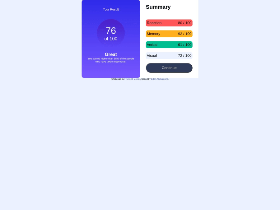
@skadanka Hello Eden, your development looks good, to make the content positioned in the center, you can apply the following CSS styles to the body tag:
body {
   height: 100vh;
   display: flex;
   justify-content: center;
   align-items: center;
}
Marked as helpful1@skadankaPosted about 1 year ago@hady68 Thanks for the feedback, from my understanding setting fixed height is not recommended, there is another way to achieve the same results?
1@hady68Posted about 1 year ago@skadanka That's not true for all cases, sometimes, the body is not taking the height it is supposed to, because we have not initiated the size, that's where the
100vhcomes in play as per me, also considering your point I agree that static is not always the best.Here's an article you can follow to look through some other ways as well - via flexbox https://dev.to/fenok/stretching-body-to-full-viewport-height-the-missing-way-2ghd
Hope it helps 👌
Marked as helpful0 - @onyedikachi23Posted about 1 year ago
Your design is good, but doesn't look so much like the preview design. Your can improve and seek help from me and the community if you need.
Marked as helpful0
Please log in to post a comment
Log in with GitHubJoin our Discord community
Join thousands of Frontend Mentor community members taking the challenges, sharing resources, helping each other, and chatting about all things front-end!
Join our Discord
