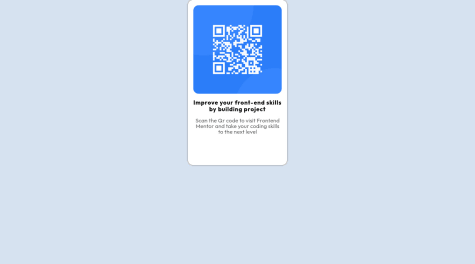
I am interested in receiving feedback or suggestions on other ways to approach and complete this challenge. Thank you.
omni23
@omni23All comments
- @UliMurSubmitted over 1 year ago@omni23Posted over 1 year ago
I'm actually going to disagree here a bit with the media query feedback. For this particular challenge there aren't multiple layouts, which media queries are usually used for to accommodate different devices of different widths (e.g, desktop v. mobile).
There is a actually a much simpler solution to your issues here (the QR code image being pushed to the right of the card itself) and that seems to stem from a misunderstanding of the margin/padding/border properties. For this I'd review the box model by checking out this MDN documentation.
A few helpful things I'd like to point out:
First, you are using three divs for your QR container but really you only need one containing the image, heading, and paragraph text. After you've reviewed the above article and refactored your HTML to only have a single div you will see that the spacing between those elements and the edges of the card itself can be achieved with just one line of padding in your container div. For creating spacing between the image, heading, and text you can use margin. Or, you could also use flex-box to do something like this:
.qr-code-card {
    display: flex;
    flex-direction: column;
    /*make container line up items vertically as by default flex layout will position things in a
    row horizontally*/
    gap: 10px; /*this will create the spacing between the QR card's elements (img, heading, paragraph)*/
}
I'd again recommend MDN documentation for flex or check out this tutorial that was helpful to me when I was learning flex. But I would personally focus on the box model first before you move on to more complex layout modes like flexbox.
You also have display: grid and place-items: center on your body to center your QR code which is totally fine. But then you are also using margin: 0 auto in your qr-code-card class. Margin: 0 auto isn't really doing anything here as it is only going to center an element horizontally in relation to its containing element and you are already aligning the QR card both horizontally and vertically with the aforementioned grid properties.
You have display: block set on your QR code image but because both headings (h2 in your markup's case) and paragraph are block elements and not inline they will automatically start on a new line.
Lastly, I'd recommend not setting a max-width on the QR card and set it in rem units. Max-width is letting your QR card shrink below 280px and the content is wrapping and causing the height of your card to stretch (not sure if this is really too big of an issue since most screen sizes aren't going to cause this to shrink at such a small size, but just for better practices sake). Rem units are relative to the font size of the root element (html tag) so that the container itself will stay a fixed width without content wrapping and also scale with font size if a user needs to increase font size in their browser settings for accessibility reasons.
I hope this info helps. Best of luck to you and happy coding =)
0 - @Voldemort-07Submitted over 1 year ago
Hello, one of the most difficult issues while creating the project was exactly centering and padding, but I tried to do my best.
@omni23Posted over 1 year agoThere are a few ways to go about centering your QR div. In this case I think the easiest way is to just make your body a flex container like so:
body {
    display: flex;
    justify-content: center;
    align-items: center;
}
I see you are already using flexbox for several of your divs (.qr__img and .qr__img-text) but I think there are some misunderstandings. For example:
.qr .qr__img {
    display: flex;
    flex-direction: column;
    justify-content: center;
    align-items: center;
}
This .qr__img div is layed out in the parent div (.qr) in normal flow. Therefor the width of .qr__img is going to stretch to be 100% of the .qr div's content area. Its height is going to stretch based on its content since no explicit height was ever set. So the image is taking up the full space of your .qr__img div. Because of this there is no reason to have this be a flex container. The justify-content and align-item properties aren't really doing anything here as there is no extra space in which you can adjust the image. You can remove the entire .qr .qr__img selector and its properties and the page will be no different except you will have more lightweight CSS.
For your .qr__img-text selector you are also using flex and specifying the direction to be column. This is also unnecessary as both <h2> and <p> tags are block elements and will stack vertically without specifying the container's layout mode to be flex.
For a better understanding on flexbox (it's crucial to understand the main and cross axis) I'd check out this tutorial by interneting is hard
Marked as helpful0 - @MatdeamonSubmitted over 1 year ago
The responsive between Desktop and Mobil diveces. This is the worst I wonder how to do it to get two different styles depending on the device selection.
@omni23Posted over 1 year agoOne thing I'd recommend is changing the unit you're using for your QR container. As it stands you are using a percentage based width that is relative to the parent (body element) container. But when the viewport is resized the body element's width resizes with it, causing the width of the QR container to also change. This causes the text inside the QR container to wrap and increase its height. Try using rem for the width to avoid this while also having your component scale with the font size whenever the user changes it in their browser settings.
1


