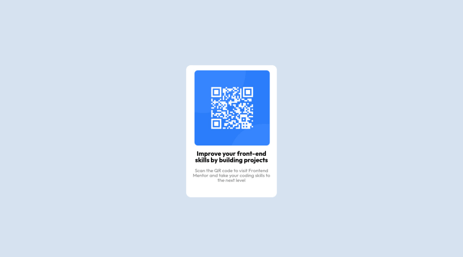


Design comparison

Solution retrospective
I am interested in receiving feedback or suggestions on other ways to approach and complete this challenge. Thank you.
Community feedback
- @Bader-IdrisPosted over 1 year ago
You can set the container in the middle of the screen whatever user changes it when you add these properties to it in CSS:
.container {
  display: absolute;
  top:50%;
  left: 50%;
  transform: translate(-50%, -50%);
}
the new feature is transform, it has many lovely properties you can discover, I personally love it. Hope it's useful
Marked as helpful0 - @rogerio-sousa-ribeiroPosted over 1 year ago
Boa tarde,
Complementando o que foi dito pelo colega, falta realizar os ajustes para diferentes telas, pois a porcentagem ocupada na tela está fixa para todos os tamanhos. Abaixo segue um exemplo que pode ajudar.
@media (max-width:475px){ .qr-code-card{ width:80%; } }
Marked as helpful0 - @khushi0909Posted over 1 year ago
1)Below 425 x 376 screen size ,you qr code goes right, you need to learn about responsiveness to correct it .ex-media queires
2)you should learn about semantics HTML and using it for ex footer ,main etc
3)Read about h1 tag its the most important and every website should have atleast one https://www.semrush.com/blog/h1-tag/
Al the best
Marked as helpful0 - @omni23Posted over 1 year ago
I'm actually going to disagree here a bit with the media query feedback. For this particular challenge there aren't multiple layouts, which media queries are usually used for to accommodate different devices of different widths (e.g, desktop v. mobile).
There is a actually a much simpler solution to your issues here (the QR code image being pushed to the right of the card itself) and that seems to stem from a misunderstanding of the margin/padding/border properties. For this I'd review the box model by checking out this MDN documentation.
A few helpful things I'd like to point out:
First, you are using three divs for your QR container but really you only need one containing the image, heading, and paragraph text. After you've reviewed the above article and refactored your HTML to only have a single div you will see that the spacing between those elements and the edges of the card itself can be achieved with just one line of padding in your container div. For creating spacing between the image, heading, and text you can use margin. Or, you could also use flex-box to do something like this:
.qr-code-card {
    display: flex;
    flex-direction: column;
    /*make container line up items vertically as by default flex layout will position things in a
    row horizontally*/
    gap: 10px; /*this will create the spacing between the QR card's elements (img, heading, paragraph)*/
}
I'd again recommend MDN documentation for flex or check out this tutorial that was helpful to me when I was learning flex. But I would personally focus on the box model first before you move on to more complex layout modes like flexbox.
You also have display: grid and place-items: center on your body to center your QR code which is totally fine. But then you are also using margin: 0 auto in your qr-code-card class. Margin: 0 auto isn't really doing anything here as it is only going to center an element horizontally in relation to its containing element and you are already aligning the QR card both horizontally and vertically with the aforementioned grid properties.
You have display: block set on your QR code image but because both headings (h2 in your markup's case) and paragraph are block elements and not inline they will automatically start on a new line.
Lastly, I'd recommend not setting a max-width on the QR card and set it in rem units. Max-width is letting your QR card shrink below 280px and the content is wrapping and causing the height of your card to stretch (not sure if this is really too big of an issue since most screen sizes aren't going to cause this to shrink at such a small size, but just for better practices sake). Rem units are relative to the font size of the root element (html tag) so that the container itself will stay a fixed width without content wrapping and also scale with font size if a user needs to increase font size in their browser settings for accessibility reasons.
I hope this info helps. Best of luck to you and happy coding =)
0


Please log in to post a comment
Log in with GitHub
Join our Discord community
Join thousands of Frontend Mentor community members taking the challenges, sharing resources, helping each other, and chatting about all things front-end!
Join our Discord