Not Found
Not Found
Not Found
Not Found
Not Found
Not Found
Not Found
Not Found
Not Found
Not Found
Not Found
Not Found
Not Found
Not Found
Not Found
Not Found
Not Found
Not Found
Not Found
Not Found

Submitted

QR code component

@Voldemort-07

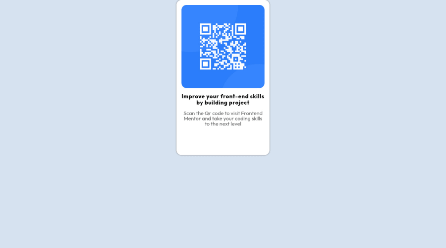
Desktop design screenshot for the QR code component coding challenge

This is a solution for...

  • HTML
  • CSS
1newbie
View challenge

Design comparison


SolutionDesign

Solution retrospective


Hello, one of the most difficult issues while creating the project was exactly centering and padding, but I tried to do my best.

Community feedback

fahledu 30

@fahledu

Posted

very nice... what do you think about put your div class .qr inside a container and apply: display: flex; align-items: center; justify-content: center; width: 100% height: 100vh;

Marked as helpful

0
omni23 50

@omni23

Posted

There are a few ways to go about centering your QR div. In this case I think the easiest way is to just make your body a flex container like so:

body {
    display: flex;
    justify-content: center;
    align-items: center;
}

I see you are already using flexbox for several of your divs (.qr__img and .qr__img-text) but I think there are some misunderstandings. For example:

.qr .qr__img {
    display: flex;
    flex-direction: column;
    justify-content: center;
    align-items: center;
}

This .qr__img div is layed out in the parent div (.qr) in normal flow. Therefor the width of .qr__img is going to stretch to be 100% of the .qr div's content area. Its height is going to stretch based on its content since no explicit height was ever set. So the image is taking up the full space of your .qr__img div. Because of this there is no reason to have this be a flex container. The justify-content and align-item properties aren't really doing anything here as there is no extra space in which you can adjust the image. You can remove the entire .qr .qr__img selector and its properties and the page will be no different except you will have more lightweight CSS.

For your .qr__img-text selector you are also using flex and specifying the direction to be column. This is also unnecessary as both <h2> and <p> tags are block elements and will stack vertically without specifying the container's layout mode to be flex.

For a better understanding on flexbox (it's crucial to understand the main and cross axis) I'd check out this tutorial by interneting is hard

Marked as helpful

0

Please log in to post a comment

Log in with GitHub
Discord logo

Join our Discord community

Join thousands of Frontend Mentor community members taking the challenges, sharing resources, helping each other, and chatting about all things front-end!

Join our Discord