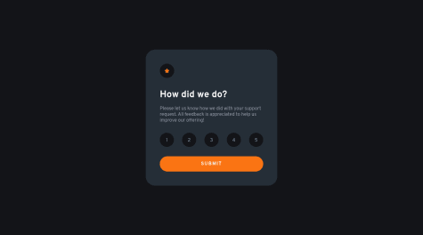
¿Is there any css unnecesary?
Numan Iftikhar
@numan-iftikharAll comments
- @FrancoMinatiSubmitted about 2 years ago@numan-iftikharPosted about 2 years ago
Hey, here are some suggestions:
- Avoid using different selectors for selecting same thing i.e., button etc.
- You are using 3 selectors to select the button. Just give it a class name and boom!
- You can make grid column responsive using auto-fit and minmax etc on grid-template-columns
- Set font-size in rem
- Use
<a></a> tagfor learn more button, bcz its a navigation.
0 - @samarhussain007Submitted about 2 years ago
i fear that my code could be clumsy, if you could point out the errors and give a proper review
@numan-iftikharPosted about 2 years agoHi, you have provided the wrong link to your repo. It links to QR code challenge. Some tips:
- Use semantic HTML
- Use radio buttons for ratings
- Use form tag for wrapping ratings and submit button
0 - @AneuralSubmitted about 2 years ago
I did what I could with what I know so far, any help on how to make everything more efficient would help me a lot, thanks for the feedback in advance.
@numan-iftikharPosted about 2 years agoHi, you did good work. Here are some tips:
- Use
maintag to wrap card content - Use
flex-direction: column;to have footer at bottom - Brush up your flexbox if you need
- Don't use media queries, these are just irrelevant
- Use classes instead of ids
- Decrease the height and width of your card
- Use
remforfont-sizeproperty
Marked as helpful0 - Use
- @amch123Submitted about 2 years ago
Please tell me how I can improve and best practices
@numan-iftikharPosted about 2 years agoHi, you did fantastic work with your design. It's almost pixel perfect. Here are some suggestions:
- Use
maintag to wrap all the content - Get your HTML right
- Don't use unnecessary
divtags - Always use
reminstead ofpxfor settingfont-sizeproperty - Avoid
text-align: centerin every element
Marked as helpful0 - Use
- @Remy349Submitted about 2 years ago
Any advice on how to better adapt the background image?
@numan-iftikharPosted about 2 years agoHey, You did great work with design. Here are some suggestions:
- Your HTML is not semantic
- article tag is not necessary since it's not an article at all
- Try centering main card by applying styling on the body tag
- Use anchor tag instead of a button in
proceedbutton - Wrap nav links in nav tag
Marked as helpful0 - @A-Tech-ServicesSubmitted about 2 years ago
This is my second attempt of making this project, and i really appreaciate the feed back from those people that corrected me in my first attempt of this project. i will appreciate if this one can also be reviewed and how i can improve on my coding.
Thank you very much.
@numan-iftikharPosted about 2 years agoHey, I've checked out your code. You did a great work. I've a few recommendations:
- use radio buttons instead of divs
- add validation, if rating not selected
- improve semantics and class names
- use camelCase naming convention
1 - @Masin1Submitted about 2 years ago@numan-iftikharPosted about 2 years ago
Hey dear, I've made a pull request to your code on github. I've fixed a lot of things. Do check it out and remember to read the pull request message :)
0 - @VvalenpSubmitted over 2 years ago
I'm new doing this and it's my first challenge... I did this project with HTML and CSS only. At first it didn't cost me but finally I had problems adapting what I did in desktop (1440px) to device (375px). I highly recommend it for practice.
@numan-iftikharPosted over 2 years agoIt's not responsive because relative units are being used and some additional CSS properties are also there that don't work with position: absolute; HTML needs to be well-structured and CSS needs to be precise. Attrubution div must be centered at the bottom.
0


