Skip to content
Learning paths
Challenges
Solutions
Articles
Unlock Pro
Log in with GitHub
Profile
Overview
Solutions
5
Comments
0
P
Matias
@matiaslagoevia
Follow
All solutions
Submitted about 1 year ago
Responsive Stats Preview Component using Flexbox & BEM
#bem
HTML
CSS
1
3
0
Submitted about 1 year ago
Responsive order summary component using BEM
#bem
HTML
CSS
1
9
0
Submitted about 1 year ago
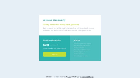
Responsive price component using CSS Grid & Flexbox
HTML
CSS
0
3
0
Submitted about 1 year ago
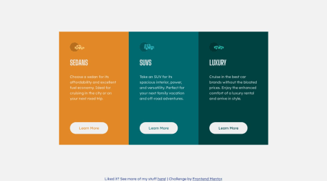
Responsive 3 Column Card Previewer using Flexbox
HTML
CSS
1
11
0
Submitted about 1 year ago
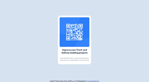
QR Component using Flexbox
HTML
CSS
1
7
0