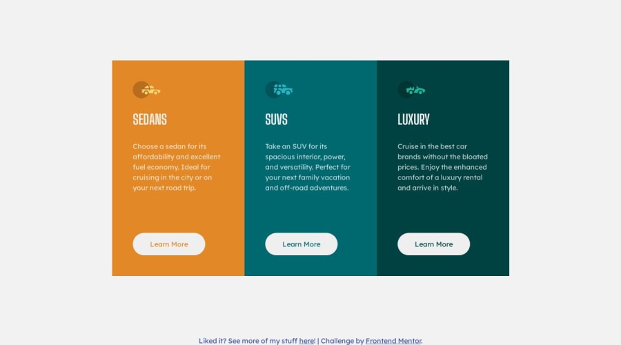


Design comparison

Solution retrospective
This was a fun project to participate in! Conquering Responsive Layouts course, as well as past experience from the QR project, made it easier for me, which I'm interpreting as a good sign :)
Open to any feedback possible, and whether I implemented the wrapping behavior correctly.
Community feedback
- @MelvinAguilarPosted about 1 year ago
Hello there 👋. Good job on completing the challenge !
I have some suggestions about your code that might interest you.
- Use only one
<h1>tag per page. Instead of <h1> for 'Sedans', 'SUVs', and 'Luxury', use <h2>. Learn more 📘
- Replace
<button>with<a>forLearn More. Buttons are for actions; links are for navigation. Learn more 📘
- Omit alt text for decorative images like car icons. Leave the alt attribute empty to hide them from screen-readers. Learn more 📘
- Instead of specifying max-width for each component individually, it's advisable to set the
max-widthfor the entire component. This allows for more flexible resizing.
I hope you find it useful! 😄 Above all, the solution you submitted is great!
Happy coding!
Marked as helpful1P@matiaslagoeviaPosted about 1 year ago@MelvinAguilar thanks for the great feedback and the links! I'm addressing the feedback in the
v1-feedbackbranch.For the
<button>replacement feedback, I chose that because I didn't know whether the action would be to navigate to another page or to show a modal dialog or sth, and I interpreted it to be a dialog. This is an area for me to work on for the future as well (clarifying ambiguity with the client/stakeholder), thank you! If you were in that position, what would you say the spec is? I'll be happy to implement it accordingly.For the
max-widthfeedback, I'm interpreting this to mean that you'd put that in the.card-preview(parent div) rather than each.cardspecifically. I was placing it there because I also wanted to specify theaspect-ratioto ensure that the cards stayed with the right proportion. Does your advice still apply? Is there something I'm missing? I'm not sure I am at a skill level where I completely understand the point you shared, so I may need some further explanation to understand and implement it, and I'd be happy to do so!Thanks again for your time and feedback!
0 - Use only one

Please log in to post a comment
Log in with GitHub
Join our Discord community
Join thousands of Frontend Mentor community members taking the challenges, sharing resources, helping each other, and chatting about all things front-end!
Join our Discord