Submitted about 1 year ago
Responsive price component using CSS Grid & Flexbox

P
@matiaslagoevia

Design comparison
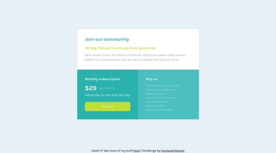
SolutionDesign

Solution retrospective
Happy to learn more from yet another fun challenge! Thanks to everyone in the community for creating the platform & engaging ways to continue to learn :)
What I found difficult
- I'd skipped some of the roadmap projects due to excitement and wanting to get to "bigger" things faster, and was reminded why that is not a good idea! When I came back to this project, the amount of learning was still there, but in a reasonable leap rather than too much too fast. Patience is important too!
- Learning about CSS Grid was interesting, and the equal column sizing and grid-template-areas were new concepts to wrap my head around that took a while for me to get, but happy I did it
- Initially, I thought getting the sign up button to have the horizontal padding to match available width without stretching it would be difficult, but then I arrived at making it's parent a flex container to get there on time
Areas of code I'm unsure of Nothing specific, open to any feedback! I'm already getting more and more convinced behind getting used to BEM, but I think that for this challenges' complexity how I structured HTML and CSS is okay?
Best practices questions
- Could I have used any semantic elements over div for
.description,.sign-upand.why-us? I thought about it but I wasn't sure, and I followed Kevin's advice of "for semantic elements, as you're learning more about them, if you're not sure it's better not to put them than to put the wrong one". I'd love to learn from a more experienced dev what they would've went with here. - Using the accessibility panel in the web console for Firefox, I see some warnings for contrast in text colors/etc. I followed the Figma spec as close as possible, but I'm unsure if this is somewhere I went wrong or a place where the spec could be more accessible. I would be happy to help in any case to arrive at better accessibility, whether the room for improvement is just on my solution or on the challenge as well.
Thanks again, and look forward to chatting in the comments and in future solutions!
Community feedback
Please log in to post a comment
Log in with GitHubJoin our Discord community
Join thousands of Frontend Mentor community members taking the challenges, sharing resources, helping each other, and chatting about all things front-end!
Join our Discord