P
@jclegg31Submitted over 1 year ago
Hi, Julie! Congratulations on completing the challenge, it was really good! 👏🏻
Answering your question...
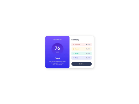
To prevent the bars in the summary section from collapsing on small screens, simply add the white-space: nowrap; property to the black-text class.
.black-text {
   white-space: nowrap;
}
And to prevent the content from causing overflow, set a minimum width for the summary section, this way the summary-score will not break.
.summary {
   min-width: 16rem;
}
Another detail that I noticed is that the gap between scores is very small on small screens and is almost unnoticeable. I recommend adding the gap property to the summary-scores flex container, this way it will create a space between all flex items.
.summary-scores {
   gap: 1rem;
}
Congratulations once again, great job! 😁
Hey, @Lnumber1! Congratulations on completing this challenge! 👏🏻
Regarding the hero section, an easy way to achieve the proposed design is using CSS Grid. Using it, you can separate content more precisely, without having to use absolute position.
For example, you could structure the section as follows:
  <section class="hero">
    <div class="hero__container">
      <div class="hero__wrapper"> <!-- grid container -->
        <div class="hero__content"> <!-- grid item -->
          <h1>Modern Gallery Art</h1>
          <div>
            <p>
              The arts in the collection of the Modern Art Gallery all started from a spark of
              inpsiration. Will these pieces inspire you? Visit us and find out.{' '}
            </p>
            <a href="/location">Our location</a>
          </div>
        </div>
        <div class="hero__image"> <!-- grid item -->
          <img src="img/desktop/image-hero@2x.jpg" />
        </div>
      </div>
    </div>
  </section>
The structure consists of a container that will define the maximum width occupied by the content, inside it a wrapper that will define the grid, and inside this grid, we will have a div with the content and a div with the image.
This way, you can define which columns of the grid each child element will occupy, that is, which columns the div with class hero__content and the div containing the image will occupy.
By defining that the content will occupy the entire grid and the image will only occupy a few central columns, you can achieve the desired layout.
The CSS would look something like this:
  .hero__container {
    max-width: 1110px;
    margin: 0 auto;
  }

  .hero__wrapper {
    display: grid;
    grid-template-columns: repeat(12, 1fr); /* divide into 12 equal columns */
    column-gap: 30px;
  }

  .hero__content {
    grid-column: 1 / -1;  /* fills all columns in the grid */
    grid-row: 1; /* occupies the first row */

    display: flex;
    align-items: start;
    justify-content: space-between;

    padding-top: 12rem;
  }

  .hero__image {
    grid-column: 4 / -4;  /* fill columns 4-5-6-7-8 */
    grid-row: 1; /* occupies the first row too */
  }
When using CSS grid, if two grid items occupy the same cell, you can define which item appears above the other using the z-index property even without using absolute position. So, just make the hero__content appear over the hero__image by adding z-index: 10, for example.
Finally, to make the part with a black background, we can use a pseudo element in the section, like this:
  .hero {
    position: relative;
  }

  .hero::before {
    content: '';
    position: absolute;
    background-color: black;
    z-index: -10;

    inset: 0 50% 0 0;
    /* or */
    width: 50%;
    height: 100%;
    left: 0;
    top: 0;
  }
There are several approaches to achieving the same goal, and at first it is difficult to know which is the easiest, or which is the best. Only with practice will you find the best way that works for you. So...
Keep practicing, you are doing a great job. 😁
Hi, @00YellowLemon!! Congrats on completing the challenge!! 👏🏻
The box-shadow has the following syntax:
box-shadow: <offset-x> <offset-y> <blur-radius> <spread-radius> <color>In your code, you defined it as box-shadow: 0 4px 8px gray;
The box shadow appears from the side too, because of the blur, this is normal. But you set the color too dark, this intensifies the shadow. To make the shadow softer, just apply a color with some transparency, like: box-shadow: 0 4px 8px rgba(0, 0, 0, 0.15);
Now, if you want to reduce the box-shadow on the sides, you will have to add the fourth parameter of the property, the <spread-radius> can expand the shadow, but if the value is negative it will shrink the shadow.
In this way, changing to box-shadow: 0 16px 16px -8px rgba(0, 0, 0, 0.1); you will get a result with a bigger shadow at the bottom and a very soft shadow at the sides.
For more information read this 👨🏻💻