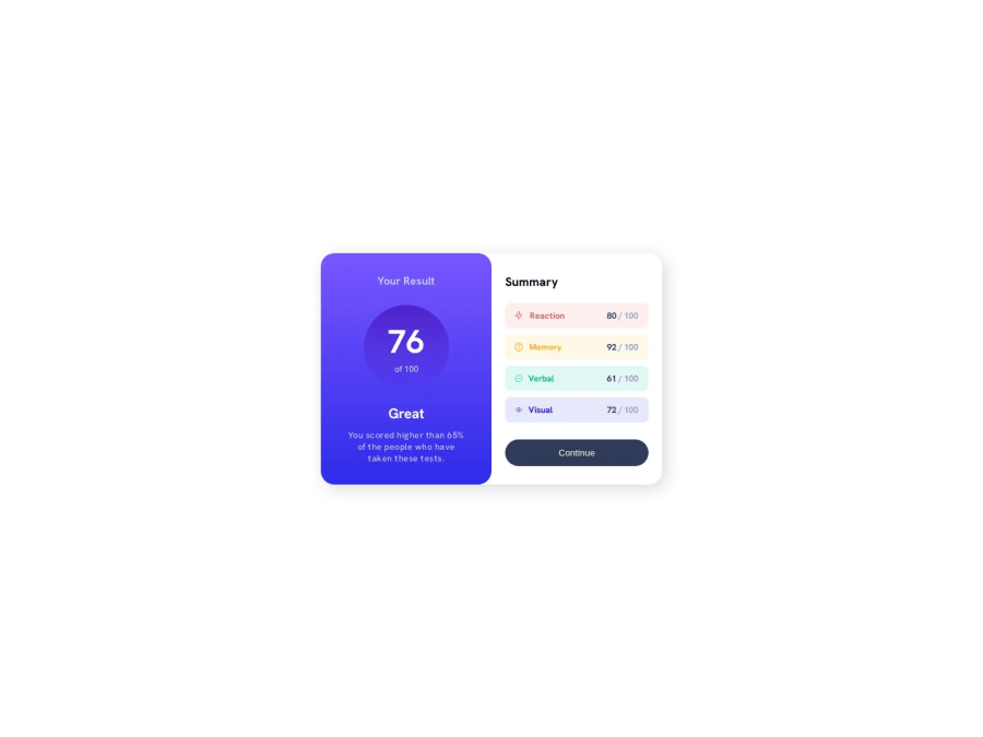
Design comparison
Solution retrospective
I think the one thing I struggled with on this one was in the mobile version, if you open the window up or down (vertical), the bars in the summary section collapse and/or the gap gets wider. Is there a way to make it so it sticks to the same height or do I want it to be flexible like this?
Any thoughts on best practices, I'm all for wanting to improve!
Thanks!
Community feedback
- @mateusbelicioPosted over 1 year ago
Hi, Julie! Congratulations on completing the challenge, it was really good! 👏🏻
Answering your question...
To prevent the bars in the summary section from collapsing on small screens, simply add the
white-space: nowrap;property to theblack-textclass..black-text { white-space: nowrap; }And to prevent the content from causing overflow, set a minimum width for the summary section, this way the summary-score will not break.
.summary {
   min-width: 16rem;
}
Another detail that I noticed is that the gap between scores is very small on small screens and is almost unnoticeable. I recommend adding the
gapproperty to thesummary-scoresflex container, this way it will create a space between all flex items..summary-scores { gap: 1rem; }Congratulations once again, great job! 😁
Marked as helpful1P@jclegg31Posted over 1 year ago@mateusbelicio thanks for the feedback and the help! I tried the first two suggestions but didn't notice a difference at all. The last suggestion definitely made a difference and that gap thing was what was bugging me. Now that it's set for not going smaller, is there way to keep it stationary if the screen is bigger top to bottom? The gap grows...
Thanks! Julie
0@mateusbelicioPosted over 1 year agoHey, Julie! Now I understand what you were talking about, I didn't understand it the first time, I'm sorry. I was looking in the horizontal direction instead of the vertical.
So what is causing this problem is the height settings you have set. You don't need to determine a fixed height, like 80%, for example. The height of each
divwill be determined by its respective content. So, just remove the heights you defined in thedivsummary and summary-score.And in addition, you defined a fixed height of
100vhin the container, this causes an overflow when the content becomes larger than this value. I recommend removing this definition so that the height of the container is defined by its content, or if you prefer, usemin-height: 100vh, this way, when the screen size is greater than the content, the container will be 100% of the screen size. screen, and if the content is larger, it will not cause overflow.And if you choose the second option and want the content to be aligned to the top, instead of creating a blank space when the screen height is too large, simply change the
justify-contentproperty present in thedivcontainer forflexible start.Happy coding! 👨🏻💻
0
Please log in to post a comment
Log in with GitHubJoin our Discord community
Join thousands of Frontend Mentor community members taking the challenges, sharing resources, helping each other, and chatting about all things front-end!
Join our Discord
