Mobile-first, responsive webpages for Modern Art Gallery
Design comparison
Solution retrospective
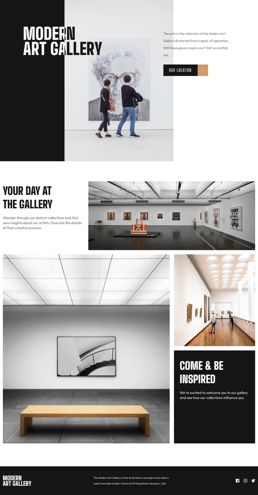
I found the hero section to be extremely difficult for desktop resolutions. I am proud of my solution, but I know there are definitely better ways to go about it. I appreciate any and all feedback about how I could have done that section better!
I also appreciate any feedback regarding the structure of my HTML. Was it too messy? Were the Tailwind classes too redundant at times? I know there are parts that I could have made more concise, and that is something I will focus on for my next project.
Thank you for taking the time to check it out!
Please log in to post a comment
Log in with GitHubCommunity feedback
- @mateusbelicio
Hey, @Lnumber1! Congratulations on completing this challenge! 👏🏻
Regarding the hero section, an easy way to achieve the proposed design is using CSS Grid. Using it, you can separate content more precisely, without having to use absolute position.
For example, you could structure the section as follows:
  <section class="hero">
    <div class="hero__container">
      <div class="hero__wrapper"> <!-- grid container -->
        <div class="hero__content"> <!-- grid item -->
          <h1>Modern Gallery Art</h1>
          <div>
            <p>
              The arts in the collection of the Modern Art Gallery all started from a spark of
              inpsiration. Will these pieces inspire you? Visit us and find out.{' '}
            </p>
            <a href="/location">Our location</a>
          </div>
        </div>
        <div class="hero__image"> <!-- grid item -->
          <img src="img/desktop/image-hero@2x.jpg" />
        </div>
      </div>
    </div>
  </section>
The structure consists of a container that will define the maximum width occupied by the content, inside it a wrapper that will define the grid, and inside this grid, we will have a
divwith the content and adivwith the image.This way, you can define which columns of the grid each child element will occupy, that is, which columns the
divwith class hero__content and thedivcontaining the image will occupy.By defining that the content will occupy the entire grid and the image will only occupy a few central columns, you can achieve the desired layout.
The CSS would look something like this:
  .hero__container {
    max-width: 1110px;
    margin: 0 auto;
  }

  .hero__wrapper {
    display: grid;
    grid-template-columns: repeat(12, 1fr); /* divide into 12 equal columns */
    column-gap: 30px;
  }

  .hero__content {
    grid-column: 1 / -1;  /* fills all columns in the grid */
    grid-row: 1; /* occupies the first row */

    display: flex;
    align-items: start;
    justify-content: space-between;

    padding-top: 12rem;
  }

  .hero__image {
    grid-column: 4 / -4;  /* fill columns 4-5-6-7-8 */
    grid-row: 1; /* occupies the first row too */
  }
When using CSS grid, if two grid items occupy the same cell, you can define which item appears above the other using the
z-indexproperty even without using absolute position. So, just make thehero__contentappear over thehero__imageby addingz-index: 10, for example.Finally, to make the part with a black background, we can use a pseudo element in the section, like this:
  .hero {
    position: relative;
  }

  .hero::before {
    content: '';
    position: absolute;
    background-color: black;
    z-index: -10;

    inset: 0 50% 0 0;
    /* or */
    width: 50%;
    height: 100%;
    left: 0;
    top: 0;
  }
There are several approaches to achieving the same goal, and at first it is difficult to know which is the easiest, or which is the best. Only with practice will you find the best way that works for you. So...
Keep practicing, you are doing a great job. 😁
Marked as helpful
Join our Discord community
Join thousands of Frontend Mentor community members taking the challenges, sharing resources, helping each other, and chatting about all things front-end!
Join our Discord
