@Mohan-art1Submitted about 2 years ago
my first project

my first project
Congratulation Mohan Nice Work 👍👍
I have a suggestion for using a font-weight prop. and opacity to get that fent look color: hsl(228, 12%, 48%, opacity);
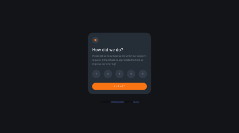
feedback appreciated. working on the JavaScript code was.......very hard, the part of marking the buttons interactive was on another level, couldn't find the answer for days and there was many many WET codes. ( document.querySelector(...) is null). i always got this error when moving to the next page, and its still there i just chose to ignore it. please if there another method of writing the rating button js code let me know.
Thanks
Hi buddy nice one your solution is great you can use forEach method for loop-over buttons clickedbutton.forEach(function (rate){ rate.addEventListener("click", () => { //Your code for display code to next page }) });
This is my solution to the Interactive Rating Component Page. Feel free to give any suggestion or pointing out any mistakes I made.
great work doing well! but want to give u suggestions about the sizing of the box and font - size Try to use padding more to get that inner margin, try to make it more visible, and make the font bit larger so it can be read easily, learn about Pseudo classes like hover to change the behaviors of function when you hover over it. Nice Work Bro! Keep it up👍
I did try to make the challenge responsive on ipad screen but failed. I also try using to media queries in my css like this /* MOBILE VIEW CSS */ @media only screen and (max-width: 480px) {
} /* IPAD VIEW CSS */ @media only screen and (max-width: 700px) {
}
but it didnt work. I cant put the both together therefore the challenge is not responsive on Ipad.
If anyone has solved this challenge and it displayed well on ipad, please help me out on how i can do that using on css media queries because i just finished a course on html and css alone i haven't learn and framework like boostrap.
Thank you Ibrahim Isiaka
I think its totally responsive to any device and width for specificly you should use @media (min-width: 480px) and (max-width: 700px) { // CSS code }
Problem solved!
You should use a div on your Image div then set your image div as a relative position and the other div as an absolute position then you have to bg color to as specified and change the opacity so that it can give you that transparent look Note: use the hover property for the first div and set its visibility property as visible and when not hover set to hidden.