Not Found
Not Found
Not Found
Not Found
Not Found
Not Found
Not Found
Not Found
Not Found
Not Found
Not Found
Not Found
Not Found
Not Found
Not Found
Not Found
Not Found
Not Found
Not Found
Not Found

Submitted

Responsive Qr-code-component using media queries

Ibrahim Isiakaβ€’ 20

@IBK999

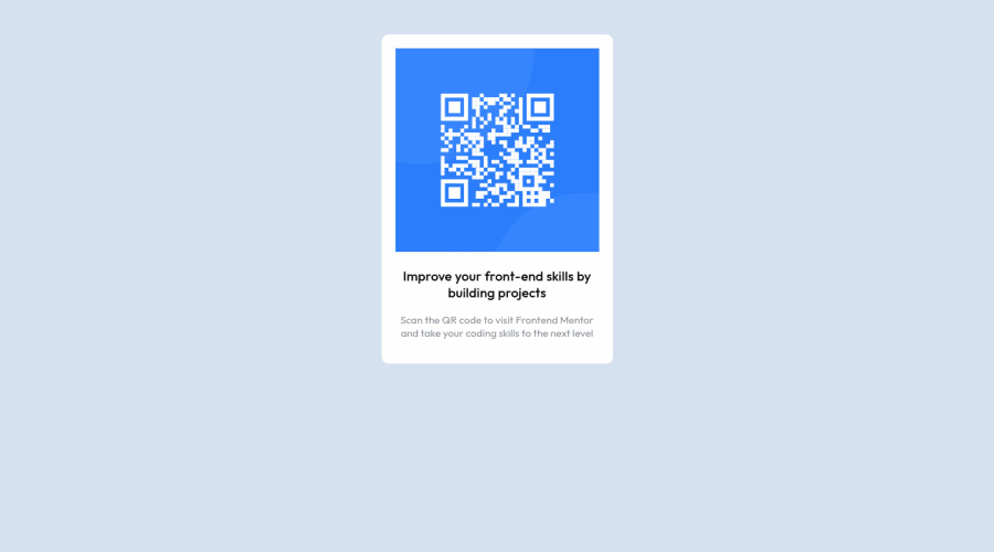
Desktop design screenshot for the QR code component coding challenge

This is a solution for...

  • HTML
  • CSS
1newbie
View challenge

Design comparison


SolutionDesign

Solution retrospective


I did try to make the challenge responsive on ipad screen but failed. I also try using to media queries in my css like this /* MOBILE VIEW CSS */ @media only screen and (max-width: 480px) {

} /* IPAD VIEW CSS */ @media only screen and (max-width: 700px) {

}

but it didnt work. I cant put the both together therefore the challenge is not responsive on Ipad.

If anyone has solved this challenge and it displayed well on ipad, please help me out on how i can do that using on css media queries because i just finished a course on html and css alone i haven't learn and framework like boostrap.

Thank you Ibrahim Isiaka

Community feedback

PhoenixDev22β€’ 16,950

@PhoenixDev22

Posted

Hi Ibrahim Isiaka

Congratulation on completing your first frontend mentor challenge. Your solution looks great. I have some suggestions regarding your solution:

  • You should use <main> landmark to wrap the card. HTML5 landmark elements are used to improve navigation experience on your site for users of assistive technology.
  • In my opinion, the image is an important content. The alternate text should indicate where the Qr code navigate the user: like QR code to frontend mentor not describes the image. The alternate text should not be hyphenated, it should be human readable.
  • Using percentages alone for widths is not really a good way, as you are losing control of the layout Consider using max-width to the card in rem instead. You don’t need to use any media queries.
  • In order to center the card on the middle of the page , you can use the flexbox properties and min-height: 100vh for the <body> add a little padding to the body that way it stops the card from hitting the edges of the browser .No need for using position absolute.

  • Remember a css reset on every project. That will do things like set the images to display block and make all browsers display elements the same.

  • Consider including a git ignore. Less important in this challenge but will become extremely important as you move onto larger projects with build steps

Overall, Excellent work! Hopefully this feedback helps.

Marked as helpful

0
Davidβ€’ 8,000

@DavidMorgade

Posted

Hello Ibrahim, congrats on finishing the challenge!

On this particular challenge there is no need of media queries to make your component responsive, first of all remove the padding from your body and the margin from your container, then center your component using flexbox on the body like this:

body {
   display: flex;
justify-content: center;
align-items: center;
min-height: 100vh;
}

Finally instead of using a big percentage width, try using a relative unit like rems and a max-width for, for example: .container { max-width: 30rem; }

Hope my feedback helps you, if you have any question don't hesitate to ask! We are here to help you!

Marked as helpful

0
Lucas πŸ‘Ύβ€’ 104,420

@correlucas

Posted

Hey Ibrahim, congratulations for your solution!

To say you the truth you don't really need to use media queries in this challenge, all you nerd is to component responsive and the image too to scale with the card. For this challenge you can use inside the container max-width: 320px this will make the card have the maximum width of 320px but the possibility to have also less than 320px, if you use instead width: 320px your card will have this fixed size and will not grow or get smaller. I can say you all you need is to change this in the container and for the image usr display: block and max-width: 100% to make the image have rhe same size of the container less it's padding.

Do these changes and you'll see a responsive card

Hope this helps, happy coding πŸ‘‹

Marked as helpful

0
Bhushanβ€’ 150

@lurnfx

Posted

I think its totally responsive to any device and width for specificly you should use @media (min-width: 480px) and (max-width: 700px) { // CSS code }

Marked as helpful

0

Please log in to post a comment

Log in with GitHub
Discord logo

Join our Discord community

Join thousands of Frontend Mentor community members taking the challenges, sharing resources, helping each other, and chatting about all things front-end!

Join our Discord