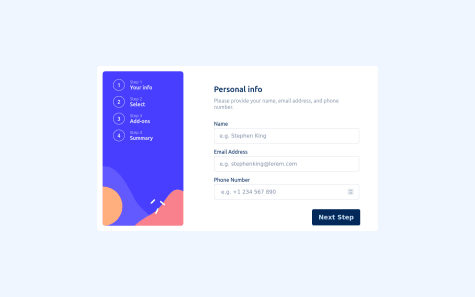
in this challenge I learn at and search a lot, this complete form took me two weeks plus to complete it, I welcome and any reviews and comments
Luca
@lgorvinAll comments
- @OGBENI-NGSubmitted almost 2 years ago@lgorvinPosted almost 2 years ago
Hi Adeolu, good job on completing this project. Very impressive for Vanilla JS and CSS. The responsiveness is great and works perfect.
I did notice that when the page is full screen, the next step and go back buttons are not in the correct place. When you go back to page one whilst in full screen after going through the other pages then 2 next step buttons appear.
I'd personally make some changes to the size of the fonts especially on the add-ons page as it appears a bit cramped.
You should try out some frameworks, would definitely help to widen your expertise.
Marked as helpful0 - @MohammedDukeSubmitted about 2 years ago
Hello community , I have completed another frontend mentor challenge. For sure , I've learnt few new things.
I would be happy , if you see something has to be improved , please don't hesitate and leave a feedback.
Thanks in advance.
@lgorvinPosted about 2 years agoGreat job! It all looks great. A suggestion to improve the functionality would be to stop users from being able to input numbers into the cardholder's name and letters into the card number input etc...
Marked as helpful1 - @LekhaKumarSubmitted about 2 years ago
Hi, I can't place the before discount price at the centre, and I am not sure why the blue border keeps appearing when clicking the button. Can anyone help me with that? Thank you.
@lgorvinPosted about 2 years agoWell done! Looks great so far. The blue border appears because you are using the btn-primary bootstrap class. With that class removed it should work without the blue border appearing.
Marked as helpful1


